Can it be done with CSS? Grouping categories on category page

What I’d like to do (as I know there’s no baked in setting or feature set) is use CSS to group categories on the home page.

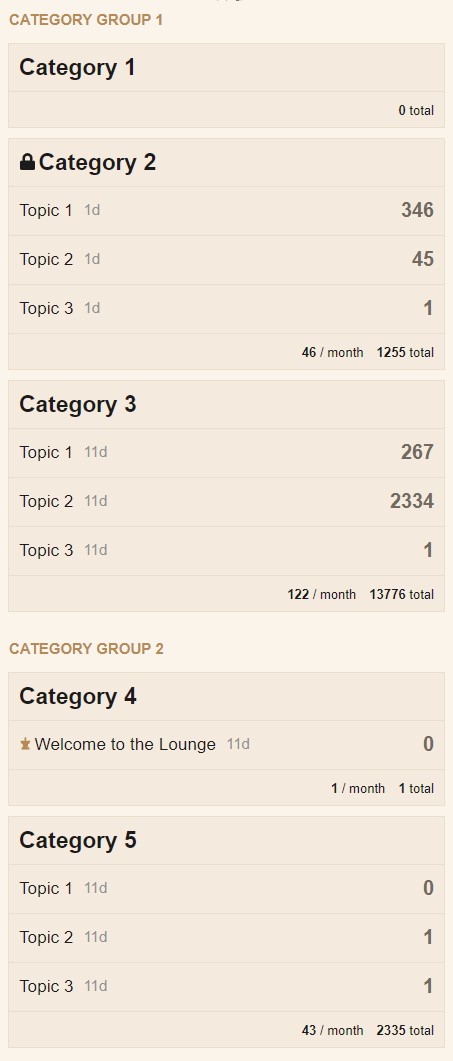
I’m not looking to nest categories, but just group some together and possibly put a header on them. I know the individual categories can be “separated” with padding, and I know each category can be targeted by category ID or category name. So what I’m hoping is to be able to replicate something that looks like this:

I realize for simplicity, the categories would have to be in their sorted order, and each category targeted by catediry_id, but I’m thinking that there’s possibly some CSS that can throw padding after one category or before another.

The big question is there the ability to insert some text in the padding to create a header?

The propose of this is to first break up the long category list view, but separate: example

  • category 1-2 under “staff” header

  • Category 3-4 under “community resources)

  • categories 5,8,11,12,13 “under general discussion categories”

I don’t want to make these sub categories, I like the structure and category system just as it is. All I want to do is display the categories a little differently on the categories view page. Ideally this is just a visual layout, NOTHING to change with the library structure of the platform.

Any idea how to make this happen?

This would be kind of a game changer for my work collaboration site’s layout.

Sam, codinghorror, do you think there would be a way to create a grouping step in the category reorganization menu that could do this natively, say as an option (grouping on/off).just put the categories in order within main page grouping and it could automatically separare them. In core, plugin or a theme component?

anyone? buehler.

feedback appreciated

This kind of stuff is possible in a theme component but extremely complicated. I think you would need to override templates which makes this also pretty fragile.

조금 늦게 올립니다 :smile: 하지만 다른 분들께 도움이 될 수 있을 것 같습니다. 몇 가지 사항을 말씀드리면 다음과 같습니다:

  • 모든 CSS 코드가 필요한 것은 아니며, 특히 테이블 행의 테두리와 배경색은 필요 없으므로 원하는 대로 자유롭게 조정해 주세요.
  • 테이블 행에는 음수 마진(negative margins)을 사용할 수 없고 다른 레이아웃 문제도 있어, 일반 테이블 레이아웃을 플렉스(flex)로 변경해야 했습니다. 또한 더 유연합니다 :smile:
  • Category Group 1과 Category Group 2를 원하는 카테고리 그룹 이름으로 대체해 주세요.
  • 제 예시에서는 카테고리 ID 2와 4를 사용했습니다. 따라서 크롬 개발자 도구를 사용하여 검사(아래 그림 참조)하여 올바른 카테고리 ID를 찾아 제 예시에서 [data-category-id="2"]와 [data-category-id="4"]를 해당 ID로 대체해 주세요.

이 코드를 공통(Common) 탭 안에 붙여넣으세요:

.category-list{
    display: flex;
    flex-direction: column;
}
.category-list thead tr{
    display: flex;
}
.category-list .topics {
    width: 95px;
    margin-left: auto;
    min-width: 95px;
    white-space: nowrap;
}
.category-list tbody tr {
    background-color: var(--primary-very-low);
    box-sizing: border-box;
    display: flex;
}
body .category-list [data-category-id="2"],body .category-list [data-category-id="4"] {
    position: relative;
    margin-top: 50px;
}
body [data-category-id="2"]::before {
    content: "Category Group 1";
}
body [data-category-id="4"]::before {
    content: "Category Group 2";
}
body [data-category-id="2"]::before,body [data-category-id="4"]::before {
    position: absolute;
    top: -35px;
    left: 0;
    font-weight: bold;
    font-size: 15px;
    text-transform: uppercase;
    color: var(--primary-medium);
}

이 코드를 데스크톱(Desktop) 탭 안에 붙여넣으세요:

.category-list tbody tr {
    margin-bottom: 15px;
    border: 1px solid var(--primary-low);
}

이 코드를 모바일(Mobile) 탭 안에 붙여넣으세요:

body .category-list-item.category .posts {
    width: auto;
    margin-left: auto;
}
body .category-list-item>footer,body .subcategory-list-item>footer{
    background-color: var(--primary-very-low);
}
.categories-list .category-list th {
    padding: 0;
}
.category-list-item>footer .category-stat, .subcategory-list-item>footer .category-stat {
    float: right;
}
.category-list-item>footer .category-stat:first-child, .subcategory-list-item>footer .category-stat:first-child{
    margin-right: 0;
}
body .category-list-item.category tr:first-of-type{
    padding: 10px 0;
    border-bottom: 1px solid var(--primary-low);
}
body tr.category-topic-link:last-of-type{
    border-bottom: 1px solid var(--primary-low);
}
body .categories-list .category-list th {
    padding: 0;
}
body .category-list-item {
    border-top: none;
    margin-bottom: 10px;
}
body .category-list-item {
    padding: 0;
    border: 1px solid var(--primary-low)!important;
}
.category-list-item>footer, .subcategory-list-item>footer {
    border-top: none;
}

데스크톱과 모바일 해상도에서의 모습은 다음과 같습니다:

Cos님, 안녕하세요.

매우 흥미롭네요. 공유해 주셔서 감사합니다. 같은 취지(더 나은 프레젠테이션을 얻기 위해)로, 현재 디스커스(Discourse) 앞에 특정 프레젠테이션을 갖춘 워드프레스 페이지를 배치하고 있습니다. 예를 들어 응답을 받은 카테고리 이름, 사용자가 선택한 카테고리, 또는 특정 카테고리를 이 페이지로 보내고 싶은데, 이것이 가능한지, 가능하다면 어떻게 해야 하는지 의견을 주실 수 있을까요?

CSS만으로 그렇게 하기는 어려울 것 같습니다. 아마도 WordPress Discourse 플러그인이 필요할 것입니다. 이 외에도 wp discourse shortcodes 플러그인도 필수입니다.
저희도 현재 WordPress 웹사이트에서 이 플러그인을 사용하고 있으며, 지금까지 잘 작동하고 있습니다. 사이드바 위젯에서 이 플러그인의 모습은 다음과 같습니다:

@sam, @cosdesign님의 답변이 작동합니다. 이 기능을 코어 메뉴에 기본으로 포함할 수 있는 방법이 있을까요? 사용자가 기본적으로 꺼둘 수 있도록 하고, 관리 패널에서 그룹 헤더 제목을 설정할 수 있으며, 각 카테고리의 속성 페이지에서 관리 패널에서 활성화된 섹션 헤더를 드롭다운으로 선택하여 카테고리가 해당 헤더 아래에 표시되도록 하는 것입니다.

이 기능을 플랫폼에 추가하는 것은 그리 어렵지 않을 것이며, 다수의 사용자 역할 및 그룹, 그리고 다수의 카테고리를 사용하는 대규모 설치 환경에서 정말 큰 도움이 될 것입니다.

이러한 그룹핑은 이제 Discourse 코어에서 지원됩니다:

‘desktop category page style’(데스크톱 카테고리 페이지 스타일)로 “Subcategories with Featured Topics”(추천 주제 포함 하위 카테고리)를 선택하세요:

그런 다음 카테고리 페이지가 다음과 같은 모습으로 표시됩니다:

RTL로 가능할까요??
시도해 봤는데 실패했어요 :broken_heart:

그렇군요. 여기서는 코어 Discourse 스타일시트가 뒤집혀서 RTL 버전이 생성됩니다: discourse/lib/stylesheet/compiler.rb at main · discourse/discourse · GitHub. 테마에 의해 추가된 CSS 파일은 RTL 버전 생성을 위해 컴파일되지 않는다고 생각합니다. 만약 이것이 맞다면, RTL 레이아웃을 사용할 때 테마에서 겪은 문제를 설명할 수 있습니다.

사이트 테마에 방향(direction)을 포함하는 몇 가지 CSS 규칙을 추가한 후, RTL 로케일로 사이트를 방문하여 방향이 뒤집히는지 확인해 볼 수 있습니다. 뒤집히지 않을 것이라고 생각합니다.

예를 들어, 테마에 다음을 추가하면:

.category-list-item>footer .category-stat, .subcategory-list-item>footer .category-stat {
    float: right;
}

이것이 다음으로 변환되지 않을 것이라고 생각합니다:

.category-list-item>footer .category-stat, .subcategory-list-item>footer .category-stat {
    float: left;
}

동의합니다. 하지만 여전히 위 코드를 어떻게 사용해야 할지 혼란스럽습니다 :confused:

어떤 제안이 있을까요?

RTL(우에서 좌로)과 호환되지 않는 테마의 예시를 아시나요? 알고 계신다면 이 주제의 해당 테마 링크를 게시해 주시면 제 가설을 테스트하고 테스트 후 무엇이 잘못되었는지 설명드리겠습니다.

수정: 여기 문제점에 대한 설명이 있습니다:

Discourse 코드베이스의 메인에 있는 CSS 파일의 경우, 사이트 레이아웃의 방향에 의존하는 대부분의 CSS 규칙을 "뒤집음(flipping)"하여 RTL CSS가 생성됩니다. 예를 들어, padding-left는 padding-right로 바뀌게 됩니다. 이는 RTLcss gem을 사용하여 수행됩니다: GitHub - discourse/rtlcss: A wrapper around the rtlcss npm package to flip CSS direction in Ruby · GitHub.

문제는 Discourse 테마의 CSS 규칙은 뒤집히지 않는다는 것입니다. 즉, 테마에 방향을 지정하는 CSS 규칙이 있는 경우, RTL 언어가 사용될 때와 LTR(좌에서 우로) 언어가 사용될 때 방향이 동일하게 유지됩니다. 이에 대한 사소한 예시는 다음과 같습니다:

테마가 RTL 인터페이스와 함께 사용될 때 padding-left: 8px;는 padding-right: 8px;로 뒤집히지 않습니다. 이로 인해 정렬에 사소한 문제가 발생합니다. RTL 언어와 함께 테마가 사용될 때 발생하는 더 큰 문제들의 예시가 더 있을 것이라고 확신합니다.

Discourse 기본 테마의 테마 편집기에 추가하는 모든 CSS에 대해서도 동일한 것이 적용됩니다. 이 주제에서 가져온 코드를 사용한 예시는 다음과 같습니다: Can it be done with CSS? Grouping categories on category page - #4 by cosdesign.

해당 CSS에서 방향을 설정하는 규칙은 다음과 같습니다:

body [data-category-id="2"]::before,body [data-category-id="4"]::before {
    position: absolute;
    top: -35px;
    left: 0; // 이 부분은 변경이 필요합니다
    font-weight: bold;
    font-size: 15px;
    text-transform: uppercase;
    color: var(--primary-medium);
}

RTL 로케일을 사용하는 경우, 문제는 다음과 같습니다:

해당 규칙이 핵심 Discourse CSS 파일에 있었다면, RTL 언어가 선택될 때 left: 0;가 자동으로 right: 0;로 변환되었을 것입니다. CSS가 테마에 추가되었기 때문에, 이를 수동으로 다음과 같이 편집해야 합니다:

body [data-category-id="2"]::before,body [data-category-id="4"]::before {
    position: absolute;
    top: -35px;
    right: 0; // RTL 레이아웃에 맞는 적절한 위치로 변경
    font-weight: bold;
    font-size: 15px;
    text-transform: uppercase;
    color: var(--primary-medium);
}

Discourse는 RTL 레이아웃이 사용될 때 html 태그에 rtl 클래스를 추가합니다. 테마 개발자는 이 클래스를 사용하여 테마가 LTR과 RTL 레이아웃 모두에서 작동하도록 만들 수 있습니다. 이는 작동하며, 제 생각에는 이것이 올바른 방법이지만, 아마도 left: auto 선언은 필요하지 않을 수도 있습니다.

body [data-category-id="2"]::before,body [data-category-id="4"]::before {
    position: absolute;
    top: -35px;
    left: 0;
    font-weight: bold;
    font-size: 15px;
    text-transform: uppercase;
    color: var(--primary-medium);
}
/* RTL 레이아웃을 위한 위치 수정 */
.rtl body [data-category-id="2"]::before,.rtl body [data-category-id="4"]::before {
    right: 0;
    left: auto;
}

개발자들이 테마에 대해 이 접근 방식을 취해야 하는지 확신이 서지 않습니다. 이는 시간이 많이 소요되며 오류와 유지보수 문제로 이어질 수 있습니다. 아마도 Discourse가 일부 테마를 컴파일하거나, RTL 버전을 제공하도록 고려할 수 있을 것입니다. 몇 가지 테마로 이 접근 방식을 테스트해 보는 것이 가치가 있을 수 있습니다:

require "rtlcss"

Rtlcss.flip_css("theme_css")

이것은 짧은 답변이 되어야 했어야 합니다. :slight_smile: 제가 쓴 내용이 정확하고 다른 주제에서 다루어지지 않았다면, 새로운 주제로 이동하는 것이 좋을지도 모릅니다.

이 Customization > Theme component 들이 원하시는 작업을 수행할 수 있습니다. 또는 코드를 참고하여 아이디어를 얻을 수 있는 좋은 기반이 될 수도 있습니다.

Air 테마에서 사용된 "Modern Category + Group boxes"가 잘 작동합니다.