>
> This is dependent on topic list content, but sometimes auto margins on \`#main-ou…tlet-wrapper\` cause the content to be too narrow:
>
> Before:
> \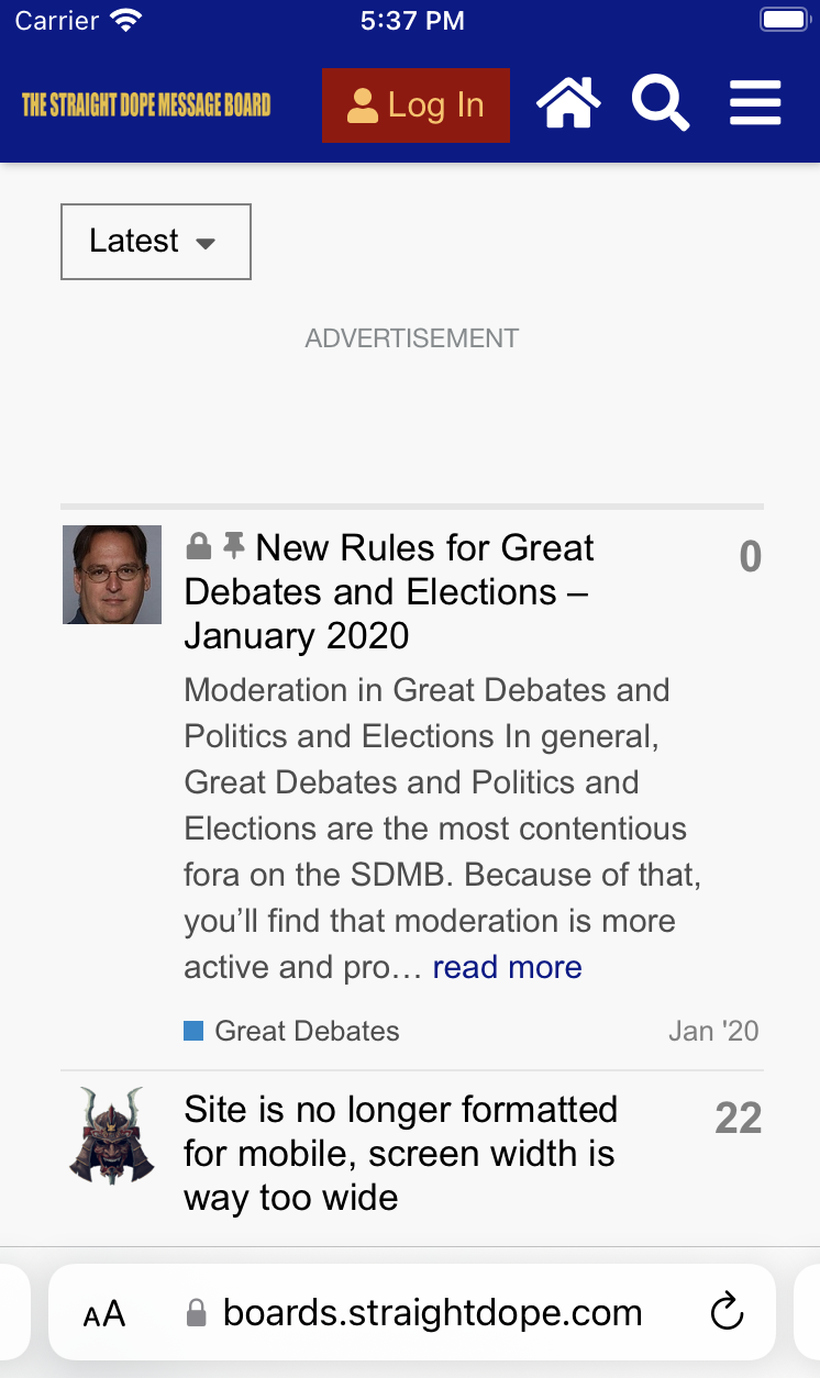 >
>
>
> After:
> \
>
>
>
> After:
> \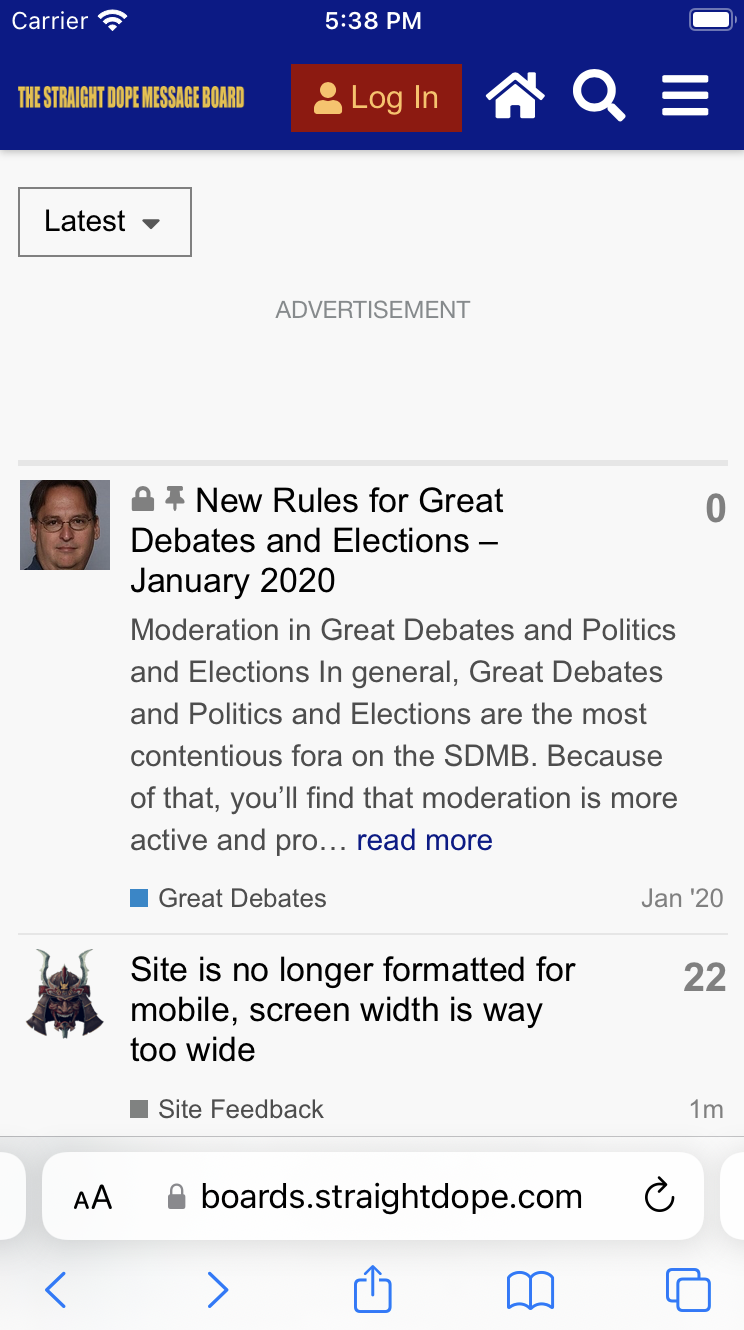 때문인 것으로 보입니다.
현재 토픽 목록에서는 일반적으로 문제가 보이지 않습니다. 따라서 해당 선언을 제거할 수 있을까요? 아니면 특정 사례가 있다면, 브레이크포인트에 할당하는 것이 더 나을 것입니다.
---
때문인 것으로 보입니다.
현재 토픽 목록에서는 일반적으로 문제가 보이지 않습니다. 따라서 해당 선언을 제거할 수 있을까요? 아니면 특정 사례가 있다면, 브레이크포인트에 할당하는 것이 더 나을 것입니다.
---
### Author:  [@pmusaraj](https://meta.discourse.org/u/pmusaraj)
#### Post date: [2월 10, 2025, 7:34오후 UTC](https://meta.discourse.org/t/do-auto-margins-still-need-to-be-unset-on-mobile/351503/2 "2025-02-10T19:34:54Z")
이 규칙을 제거해도 될 것 같습니다. 일부 테마(특히 커스텀 테마)에서 모바일에서 큰 여백이 생길 수 있지만, 대부분의 테마는 문제없을 것입니다.
다만, 태블릿에서 모바일 뷰를 보고 계신다는 점에 유의하세요. iPad의 경우 더 이상 기본값이 모바일 뷰가 아니며, 데스크톱 뷰가 기본으로 설정되어 있어 모바일 스타일시트가 로드되지 않습니다. 이 태블릿이 Android인가요?
---
### Author:  [@manuel](https://meta.discourse.org/u/manuel)
#### Post date: [2월 10, 2025, 8:06오후 UTC](https://meta.discourse.org/t/do-auto-margins-still-need-to-be-unset-on-mobile/351503/3 "2025-02-10T20:06:48Z")
네, 그건 안드로이드 태블릿이에요.
---
### Author:  [@pmusaraj](https://meta.discourse.org/u/pmusaraj)
#### Post date: [2월 10, 2025, 8:25오후 UTC](https://meta.discourse.org/t/do-auto-margins-still-need-to-be-unset-on-mobile/351503/4 "2025-02-10T20:25:31Z")
태블릿에서 가로 모드로 브라우저를 사용할 때, 모바일 사용자 에이전트를 기본값으로 설정하는 것은 _잘못된_ 선택이라고 말하고 싶다 (솔직히 세로 모드에서도 마찬가지다). 이것이 Chrome인지 다른 브라우저인지는 확실하지 않다. Chrome은 일부 경우 데스크톱 모드를 기본값으로 설정한다: [Chrome enables desktop mode by default on premium tablets | Blog | Chrome for Developers](https://developer.chrome.com/blog/desktop-mode)
---
### Author:  [@twofoursixeight](https://meta.discourse.org/u/twofoursixeight)
#### Post date: [2월 10, 2025, 8:38오후 UTC](https://meta.discourse.org/t/do-auto-margins-still-need-to-be-unset-on-mobile/351503/5 "2025-02-10T20:38:10Z")
~~아이패드와~~ 안드로이드 태블릿에서 이 문제를 재현할 수 있습니다. 다만 화면 비율 때문에 안드로이드에서 더 심합니다:

수정: 이 문제는 실제로 아이패드에서는 발생하지 않습니다. 직접 확인해 보니 정상적으로 보입니다.
---
### Author:  [@manuel](https://meta.discourse.org/u/manuel)
#### Post date: [2월 11, 2025, 11:44오전 UTC](https://meta.discourse.org/t/do-auto-margins-still-need-to-be-unset-on-mobile/351503/6 "2025-02-11T11:44:33Z")
> [@pmusaraj](#):
>
> 태블릿에서 가로 모드로 열린 브라우저의 경우(솔직히 세로 모드도 마찬가지지만) 모바일 사용자 에이전트를 기본값으로 설정하는 것이 _잘못된_ 선택이라고 말하고 싶을 정도입니다.
모바일 설정에서 제가 좋아하는 점 중 하나는 사이드바 메뉴가 페이지에 임베드되는 것이 아니라 오버레이로 슬라이드 인한다는 것입니다. 제 생각에 모바일 기기에서 더 "네이티브"처럼 느껴집니다.
브레이크포인트 선언을 추가하는 것은 어떨까요?
```plaintext
@include breakpoint(mobile-extra-large) {
#main-outlet-wrapper {
margin-left: unset;
margin-right: unset;
}
}
```
이렇게 하면 좁은 모바일 기기에서는 잠재적인 여백이 제거되고, 더 넓은 기기에서는 래퍼가 중앙 정렬됩니다.
---
### Author:  [@pmusaraj](https://meta.discourse.org/u/pmusaraj)
#### Post date: [2월 11, 2025, 3:21오후 UTC](https://meta.discourse.org/t/do-auto-margins-still-need-to-be-unset-on-mobile/351503/7 "2025-02-11T15:21:16Z")
`breakpoint(mobile-extra-large)` 옵션은 나에게도 합리적으로 보입니다. @awesomerobot의 생각도 궁금합니다.
---
### Author:  [@awesomerobot](https://meta.discourse.org/u/awesomerobot)
#### Post date: [2월 11, 2025, 9:09오후 UTC](https://meta.discourse.org/t/do-auto-margins-still-need-to-be-unset-on-mobile/351503/8 "2025-02-11T21:09:06Z")
매우 커스텀한 테마 몇 가지를 직접 테스트해 봤는데, 더 이상 이 기능이 필요하지 않은 것 같습니다… 이 기능이 추가된 지 몇 달 후, 래퍼가 `width: 100%;`와 함께 그리드로 설정되었기 때문에 이론상으로는 원래 문제가 아예 발생하지 않아야 합니다.
여기서 제거합니다.
>
>
> Reported here https://meta.discourse.org/t/do-auto-margins-still-need-to-be-unse…t-on-mobile/351503
>
> This helps better handle some situations where we want to center content on large screens while using mobile view
조사해 주셔서 감사합니다!