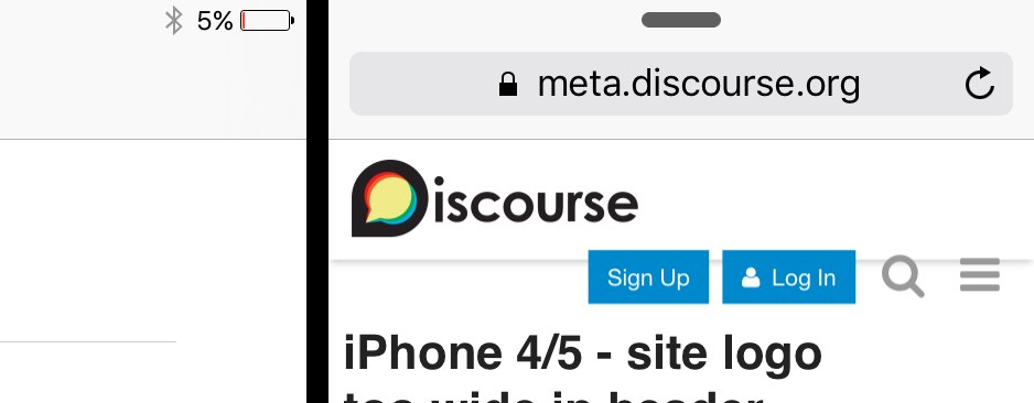
Was playing around in safari’s new responsive design mode and noticed that the logo is a little too wide when logged out pushing the buttons on the right downwards:
I don’t actually have a iPhone 4 or a 5 anymore so I can’t personally test this out on the actual device, but I seem to be able to reproduce it on both meta and try:
1 個讚
ok, looks like this is also an issue on iOS 9’s multitasking split view and slide over modes:
I think this is a different regression – both buttons should not show up on mobile; there’s simply not room for both “Sign Up” and “Log In”.
Can you post a fuller screenshot, I am not clear how you’re generating the above.
The first images are from OS X El Cap’s new responsive design mode in safari emulating an iPhone 4 or 5’s narrow display.
The second one is a screen grab from my iPad air 2 using the split screen mode. I believe discourse automatically sends the desktop version to the iPad even when in split-view/slide-over mode causing the two buttons to show up.
My iPad just died but i’ll try to post some more images tomorrow.
Maybe the button needs its own row.
No – that would make the fixed header absurdly large.
Hmm, I changed the max-width but now the logo is being pushed down. Aha looks like left over valign-helper hack, let’s get rid of that too.
wider logos still looked a little weird on mobile..
I think this should fix it:
.d-header .title{
	display: -ms-flexbox;
	display: -webkit-flex;
	display: flex;
	-ms-flex-align: center;
	-webkit-align-items: center;
	-webkit-box-align: center;
	align-items: center;
}
@media only screen and (min-width: 375px) {
	.d-header .title, .d-header #site-logo {
		max-width: 185px;
	}
}
hope this helps!
Yep that is a bug we need to fix, ideally with flexbox.