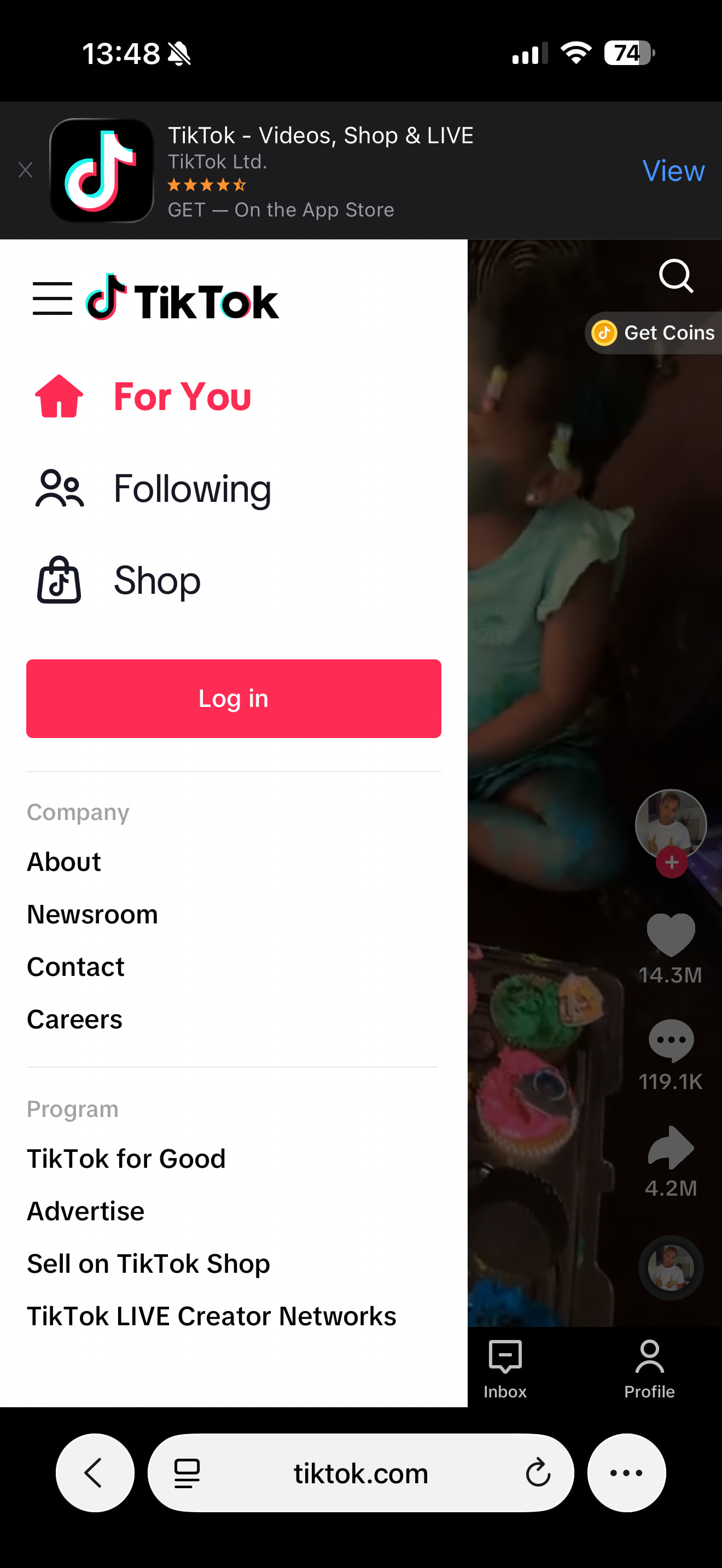
Discourse doesn’t show the “Sign Up” button on mobile, only “Log In.” If users have the presence of mind to tap the “Log In” button, there’s a link way down at the bottom to “Sign Up,” but it does require some hunting. (It’s been this way for years; I’d never noticed.)
A user emailed us today complaining that we didn’t have a “Sign Up” button, because they couldn’t find it.
And, hey, there’s not a lot of space in that header, I get that. But I had three feature requests.
The “Sign Up” button should appear at the top of the hamburger menu on mobile. If it’s important enough to appear in the site header at all, I think it at least deserves prominent placement in the menu.
I think there should be a site setting where the “Sign Up” button is primary, and the “Log In” button appears in the menu.
On mobile, the switcher from “Log In” to “Sign Up” and “Sign Up” to “Log In” and should appear higher up. The “Log In” header says “Welcome Back” and you have to scan through the entire screen before you can find the “Sign Up” button. The “Log In” button appears below the fold on the “Sign Up” screen, which is wayyy too far down if we make “Sign Up” the primary button on our site.
My Discourse doesn’t have enough room for both “Sign Up” and “Log In” on small phones. (If both buttons could fit, we wouldn’t be in this situation in the first place!)
You’re doing heroic work here, but I’m seriously outta space. (I went into Dev Tools and hacked it up; my mobile site logo is wide enough that it becomes illegibly small when “Sign Up / Log In” appears in the button, even when I remove the icon.)
I don’t think we’re doing anything out of the ordinary…
Most popular sites seem to lead with log in, some present both but usually only if they have a splash page instead of content… and to the other extreme some don’t even label the account button at all and put both options in a dropdown menu
My personal favorite approach is not differentiating at all, asking for email, then diverging based on account existence… but there are some downsides to ding that.
Before adding it to the menu by default, maybe we can consider making it more prominent on the log in page. A full button rather than the link? something sticky at the bottom so tall pages don’t bury it?
For most popular websites, I think they likely prioritize the perspective of already registered users. Most visitors probably need to log in rather than register, so having just a login button allows existing users to log in in a single step.
However, for websites with a greater focus on acquiring new users, the proportion of users needing to register may be higher.
This is just my speculation; perhaps popular websites with large user bases and ordinary websites approach this from slightly different angles.