모두들 버텨주세요… 우리만을 위한 새로운 특별 테마가 준비되었습니다!
우리의 수석 디자이너 @jordan.vidrine가 meta 커뮤니티를 위한 맞춤형 룩을 만들기 위해 열심히 작업해 왔고, 방금 새 기본 테마로 설정하는 버튼을 눌렀습니다.
마법처럼 자동으로 전환되지 않았다면, 사이드바 하단의 테마 선택기에서 찾을 수 있습니다:
직접 사용해 보고 의견을 알려주세요.
#site-feedback:theme-feedback 하위 카테고리를 통해 문제를 추가할 수 있습니다. 이상한 점을 발견하신다면 해당 카테고리에서 토픽을 만들어 주세요.
51개의 좋아요
Lhc_fl
11월 7, 2023, 11:12오전
2
이 테마가 정말 최고예요! 메타의 스타일과 정말 잘 어울리고, 정말 아름답습니다!
둥근 모서리 버튼이 특히 마음에 들어요, 정말 멋져요.
13개의 좋아요
와! 제 모바일 기기에서는 다르게 보인 것 같아서 확신은 못 했어요, 하하!
정말 멋져요. 미래에 비슷한 것을 볼 수 있게 되면, 우리 포럼에도 비슷한 디자인을 적용할 수 있겠네요.
정말 세련되었어요!
5개의 좋아요
디자인 리프레시가 벌써부터 마음에 듭니다. 정말 필요했던 UX 개편이 드디어 찾아왔네요
6개의 좋아요
몇 가지 주제를 읽은 후, 32인치 대형 화면에서 배경이 정말로 시선을 산만하게 만든다는 것을 말할 수 있습니다. 제 경우 특히 노란색 부분이 그렇습니다. 균일하지 않고 뒤쪽에서 많은 공간을 차지하기 때문에 매우 눈에 띕니다. 하지만 익숙해져야 할 수도 있으니 며칠 뒤에 다시 확인해 보겠습니다!
18개의 좋아요
이 테마는 메타(Meta)에 매우 잘 어울리며, 그 이미지를 잘 표현합니다. 어쩌면 완벽할지도 모릅니다. https://discourse.org 사이트와 똑같이 보이지만, 이제 포럼에서 사용할 수 있게 되었습니다!
5개의 좋아요
우선, 메타가 조금 리프레시되는 것 같아서 정말 좋다고 생각합니다!
다만 몇 가지 작은 지적 사항이 있습니다:
다른 분들도 언급했듯이, 현재 배경이 약간 시선을 분산시키고 있고, 사이드바 메뉴가 접힌 상태에서는 왼쪽 페이지가 제대로 렌더링되지 않습니다.
데스크톱 화면에서 콘텐츠 영역이 조금 더 넓으면 좋겠습니다 (양쪽 각각 50px 정도).
개인 메뉴/프로필 아이콘을 오른쪽 중앙 콘텐츠 블록과 정렬되도록 하는 것이 더 낫다고 생각합니다.
전반적으로 사이드바 메뉴도 콘텐츠와 어떤 식으로든 정렬되기를 원하지만, 새로운 테마는 오히려 사이드바 메뉴가 UX 측면에서 잘 어울리지 않는다는 제 생각을 강화해 줍니다. 따라서 단순히 정렬만 한다고 해서 제가 느끼는 불편함이 완전히 해결되지는 않을 수 있습니다.
4개의 좋아요
thaidb:
이 테마를 어떻게 가져올 수 있나요?
여기 meta에서는 사이드바 하단의 테마 선택기에서 선택할 수 있습니다.
자신의 사이트에서는… 선택할 수 없습니다. 이건 우리 전용 테마입니다.
8개의 좋아요
@jordan.vidrine 는 정말 마법사 같은 분이십니다
9개의 좋아요
새 테마의 대부분은 훌륭하고, 이전 테마보다 확실히 업그레이드된 느낌입니다.
제가 유일하게 미적으로 걱정하는 부분은 바로 이 섹션인데, 여기서 선과 블롭(blobs)이 제게는 전혀 의미를 전달하지 못하고, 배경이 전반적으로 너무 눈에 거슬리고 번잡합니다:
5개의 좋아요
Moin
11월 8, 2023, 8:56오전
23
WCAG 색상 체계에도 라이트 버전이 있을까요?
3개의 좋아요
색상 팔레트에서 하나를 찾아서 사용자 선택 가능하도록 체크해 두었습니다. 다만, 어떤 이유로 체크가 해제되어 있었을 수도 있으니 더 자세히 살펴볼 예정입니다.
volanar
11월 8, 2023, 9:23오전
25
인증을 완료한 후 환영 메시지는 사라져야 합니다. 유용한 공간을 차지하고 있기 때문입니다.
3개의 좋아요
tpetrov
11월 10, 2023, 9:19오전
31
홈 검색 바와 그 아래에 있는 링크(커스터마이즈, 가이드 등)는 테마 자체의 일부인가요, 아니면 테마 컴포넌트인가요?
1개의 좋아요
volanar
11월 10, 2023, 9:24오전
32
이곳은 최적의 검색 위치가 아닙니다. 이 컴포넌트를 사용하는 것이 더 좋습니다. 이 컴포넌트는 빈 공간을 차지하지 않으며, 마땅히 있어야 할 위치에 배치됩니다.
Contribute to discourse/discourse-header-search development by creating an account on GitHub.
1개의 좋아요
PhilFoss
11월 12, 2023, 3:23오전
33
솔직히 배경 텍스처와 블롭은 시선을 분산시키고, 여기 포럼에서 제시된 Discourse 소프트웨어와 콘텐츠와 무관해 보입니다.
7개의 좋아요


이 테마에 대한 버그/UX 보고서를 더 잘 정리하기 위해(그리고 새로운 Form Templates 기능을 테스트해 보기 위해


 새 테마 작업, 정말 잘하셨어요!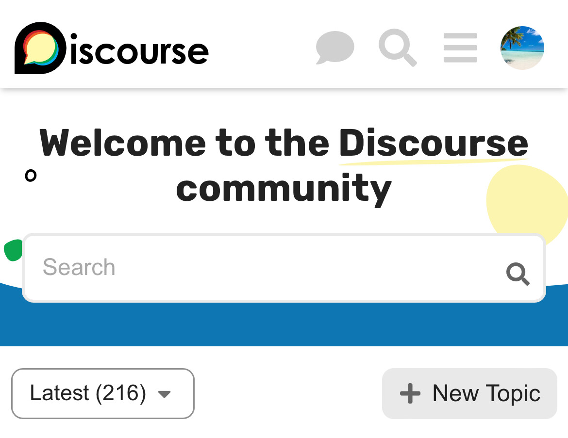

 (이미 이 토픽에서 보고를 하셨다면, 하위 카테고리에도 다시 제출해 주셔도 됩니다. 결국 제가 모두 옮겨 두겠지만, 먼저 옮겨 주셔도 괜찮습니다