디자인 팀은 현대 웹 표준에 좀 더 가깝게 맞추기 위해 기본 테마에 작지만 강력한 변경 사항/조정을 진행 중입니다. 메타에서 이러한 변경 사항을 실시간으로 확인하려면 이 그룹에 가입하세요:
https://meta.discourse.org/g/modernized-foundation
이 변경 사항은 Discourse에서 사용할 수 있는 새로운 Upcoming Changes 기능을 통해 라이브로 적용될 예정입니다. 이를 통해 사이트 소유자는 테마나 현재 커스터마이징이 깨질까 봐 걱정하지 않고 변경 사항을 테스트하기 위해 원하는 그룹에 대해 변경 사항을 활성화할 수 있습니다.
화면 공간을 효율적으로 활용하기 위해 헤더의 크기와 일부 아이콘 및 아바타 크기를 약간 줄였습니다.
회색 기본 버튼 배경에서 테두리가 있는 투명/“secondary” 배경으로 전환합니다.
회색 배경 제거
테두리 추가
아이콘 색상이 텍스트 색상과 일치하도록 변경
버튼에 고정된 높이 부여
Horizon과 일치하도록 tertiary “CTA” 배경 색상을 적용합니다.
두꺼운 상단 테두리(3px) 제거
테이블 헤더 데이터의 글꼴 크기 축소
테이블 데이터 항목의 색상 통일
읽음/안 읽음 상태에 따른 색상 값 변경
안 읽음 항목의 글꼴 굵기 약간 증가
텍스트 왼쪽 정렬
두꺼운 왼쪽 색상 테두리 제거
배지 약간 둥글게 변경
박스 테두리 얇게 변경
토픽 목록 페이지의 내비게이션 필(pill) 높이가 이 영역의 버튼과 동일해짐
선택된 키트에서 더 어두운 색상의 텍스트 및 아이콘
아이콘 및 텍스트 색상 일치
더 어두운 텍스트 및 아이콘
더 밝은 “active” 배경
더 굵은 active 글꼴 굵기
균형 잡힌 간격
커스터마이징을 통한 왼쪽/오른쪽/가운데 정렬이 용이하도록 변수 추가
헤더 글꼴 굵기 감소
부제목 글꼴 크기 감소
"버튼"에서 회색 배경 제거
“active” 상태를 나타내는 데만 회색 사용
“테두리 있는 투명” 버튼 스타일링으로 전환
드롭다운 컨테이너에 패딩 추가
높이, 패딩, 간격이 사이드바 항목과 일치하도록 변경
테두리가 --d-border-radius 변수를 상속받음
여기서 일부 변경 사항은 코어에 추가된 추가 변수를 통해 도입됩니다.
환영 배너의 정렬은 이제 다음을 통해 변경할 수 있습니다:
// default
  --welcome-banner-text-align: center;
  --welcome-banner-search-menu-margin-inline: auto;

// custom
  --welcome-banner-text-align: left;
  --welcome-banner-search-menu-margin-inline: 0 auto;
이제 다음을 통해 고정된 버튼 높이를 가질 수 있습니다:
// default
  --button-height: var(--space-8);
Horizon에서는 이미 이 기능을 사용하고 있으며, 기본 테마에도 적용하는 것이 타당합니다.
// new default
--webkit-font-smoothing: antialiased;
38개의 좋아요
Lilly
2월 6, 2026, 7:17오후
3
gist 버튼 드롭다운에 스크롤바가 있습니다(fk-d-menu에 overflow가 설정되어 있는 것 같고요?), 그리고 다른 dropdown-menu 클래스처럼 동일한 min-width: 200px이 필요하지 않을 것입니다.
수정: 괜찮아요, 이미 수정되었습니다
6개의 좋아요
Canapin
2월 6, 2026, 10:46오후
4
jordan.vidrine:
카테고리
모던 파운데이션 테마가 보이지만, 왜 여전히 구형 카테고리 레이아웃이 나타나는 건가요?
Moin
2월 6, 2026, 10:50오후
5
Meta는 Desktop category page style 사이트 설정에서 “Boxes with subcategories” 대신 "Categories only"를 사용하는 것 같습니다.
1개의 좋아요
Canapin
2월 6, 2026, 10:52오후
6
아, 스크린샷이 메타에서 촬영된 것이라고 가정했네요. 확인해봐야 한다는 생각조차 하지 못했네요.
작지만 이상한 동작입니다. 기본 테마에서
새 테마에서는 사이드바가 닫힌 상태에서
아마 환각을 보고 있는 것 같습니다
구 테마와 변경 사항을 비교하기 위해 그룹을 나갈 수 있을까요? 나가기 옵션을 찾을 수 없네요.
2개의 좋아요
네, 맞아요. 수정했습니다… 이제 원할 때 언제든 나갈 수 있습니다.
4개의 좋아요
Moin
2월 6, 2026, 10:55오후
8
@modernized-foundation 그룹에서 나가는 것을 허락해 주시겠습니까?
일부 아이콘 색상이 WCAG 팔레트와 잘 어울리지 않는 것 같습니다.
예를 들어, 그룹 페이지 왼쪽 상단의 그룹 선택기는 2줄을 제대로 지원하지 않습니다.
로그아웃했을 때의 모습입니다.
4개의 좋아요
Canapin
2월 6, 2026, 11:14오후
9
대부분의 변경 사항은 마음에 듭니다. 섬세한 변화들이에요. CSS 값을 직접 보지 않으면 차이를 알아채기 어려운 부분도 있습니다
변경 전 / 변경 후
강조된 새 주제 버튼이 좋습니다. 사실 저는 오래전에 제 포럼에서 이렇게 커스텀해 둔 적이 있어요 (코드가 깨져서 고칠 엄두를 못 낸 채로) .
변경 전 / 변경 후
이것도 좋습니다. 어두운 팔레트에서는 어두운 회색 배경에 어두운 남색 조합이 좀 어색했거든요.
변경 전 / 변경 후
새로운 버튼 스타일은 마음에 들지만, 특정 영역에서는 배경과의 대비가 부족해 보입니다. 특히 주제 푸터 부분이 그렇습니다.
7개의 좋아요
Moin
2월 6, 2026, 11:25오후
10
일부 화면 크기에서 읽기 및 토픽 활동에서 이 설정이 잘 작동하는 것 같습니다.
하지만 너비를 조금만 줄이면 “Replies”(답글)와 “activity”(활동)가 너무 크게 보입니다. (이것은 /latest에서도 문제입니다)
/my/activity/bookmarks에서도 “updated”(업데이트됨)와 “activity”(활동)에 비슷한 문제가 있습니다.
아이콘과 텍스트 색상이 일치하지 않는 또 다른 예로는 내 프로필의 확장 버튼이 있습니다.
그룹을 나갈 때의 모습은 다음과 같습니다:
jordan.vidrine:
Topic list
표 헤더의 글꼴 크기뿐만 아니라 Replies, Views, Activity 열의 숫자 크기까지 줄어든 것 같습니다.
jordan.vidrine:
header
언어 드롭다운의 아이콘이 텍스트에 비해 매우 크게 보입니다.
변경 후:
7개의 좋아요
전후 비교 이미지를 올려주셔서 정말 감사합니다. 원문(OP)에 없어서 빠진 줄 알았어요.
이 두 가지 변경 사항 모두 어색해 보입니다: after 쪽이 훨씬 대비가 낮아 보이는데, 접근성(A11y) 문제를 일으킬 수 있는 건 아닌가요?
새 그룹으로 가서 테스트를 해볼 예정입니다!
4개의 좋아요
Moin
2월 7, 2026, 5:25오후
12
토픽 맵에서 "link"라는 단어는 그룹에 가입한 후 일부만 표시됩니다:
스크린샷은 Add link to sidebar category setting to new admin menu in categories section of the sidebar 에서 촬영했습니다.
그리고 이 모달의 텍스트는 마우스를 올렸을 때 읽기 어렵습니다. 이전 대비 대비도가 더 좋았다고 생각합니다.
1개의 좋아요
기본 스타일 변경을 정말 기대하고 있습니다. 대략 언제 출시될 예정인가요?
1개의 좋아요
지금까지 모든 피드백과 버그 찾기가 훌륭했습니다. 업데이트해 주셔서 감사합니다.
5개의 좋아요
좋은 지적입니다. 저도 새로운 버튼 스타일이 꽤 마음에 드는데, 이 섹션에서는 버튼이 너무 많이 모여 있어서인지 어딘가 어색하게 느껴집니다.
5개의 좋아요
Canapin
2월 9, 2026, 11:28오후
17
읽지 않은 글의 폰트 굵기가 읽은 글보다 더 굵습니다.
제 생각에는 약간 거칠어 보입니다.
대부분의 포럼 소프트웨어에서 볼 수 있는 표준적인 굵기 차이보다는 색상의 변화만으로 처리한 디스코스의 방식이 더 우아하다고 생각했거든요.
이제는 두 가지가 모두 적용되어 있습니다. 차이는 미묘하지만, 저는 색상 변화만 적용되는 것을 선호합니다
3개의 좋아요
최근 변경 사항은 곧 다음 PR에서 배포될 예정입니다:
main ← foundation-feedback
merged 10:55AM - 10 Feb 26 UTC
Addressing most of the feedback from https://meta.discourse.org/t/modernizing-th… e-foundation-theme/395331
I've separated them into individual commits with descriptive titles.
4개의 좋아요
최종 버전은 대략 언제 출시될 예정인가요? 이 스타일 업그레이드를 정말 기대하고 있습니다.
Moin
2월 11, 2026, 7:21오전
20
정말 기대가 크신 것 같습니다. 현재 변경 사항은 실험 단계이지만, 오늘 바로 Modernize Foundation theme를 활성화할 수 있습니다: Upcoming Changes
4개의 좋아요
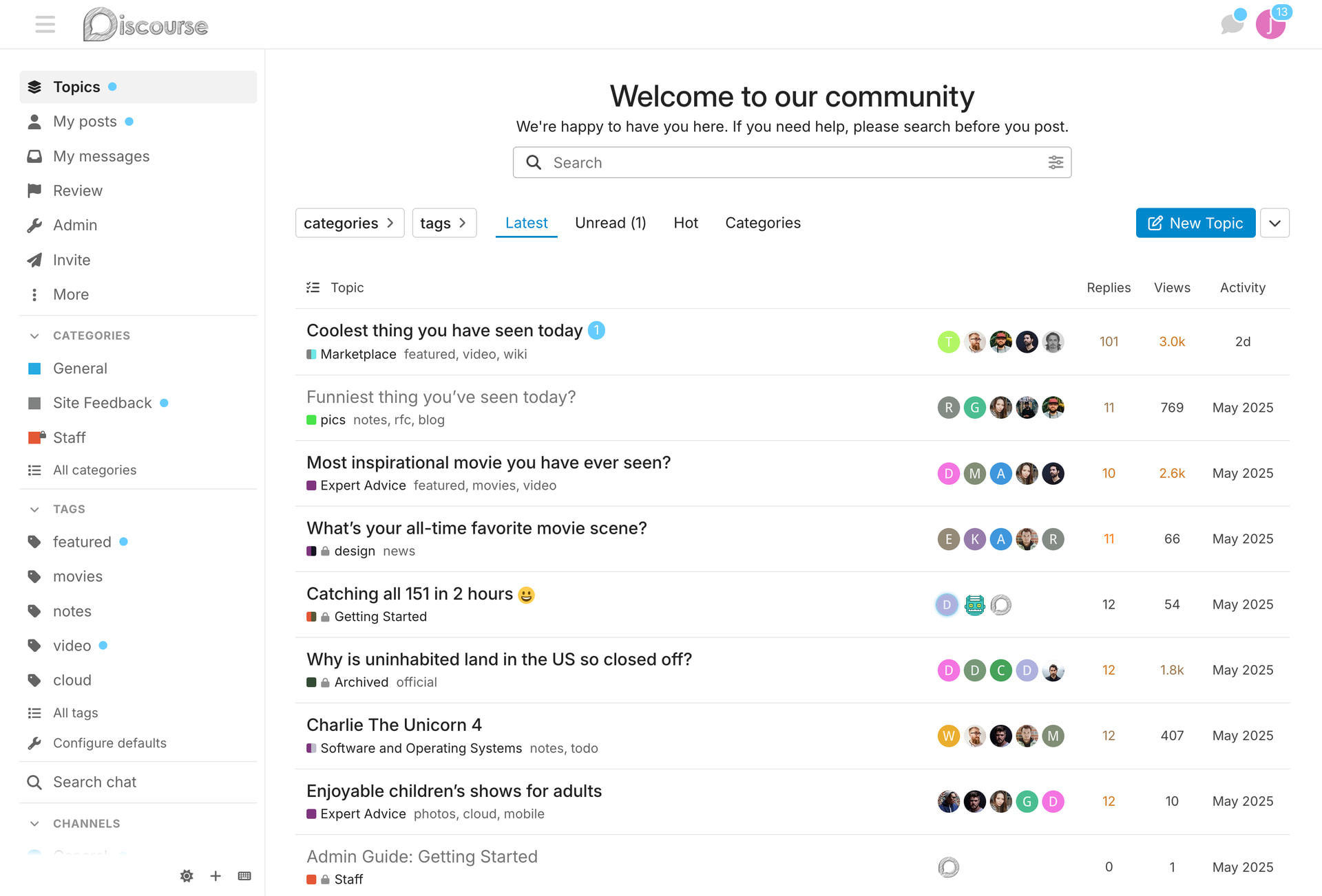


 (사이드바 아이콘과 텍스트 색상, 주제 목록의 읽음/읽지 않음 색상)


