Modernizing the Foundation theme

The design team are in the process of making small but powerful changes/tweaks to the foundation theme to align a bit closer to modern web standards. To view these changes live on meta, join this group:

https://meta.discourse.org/g/modernized-foundation

We will be making this change live through the new Upcoming Changes feature available in Discourse. This will allow site owners to enable the changes for any group they specify, in order to test the roll out of the changes without the fear of possibly breaking themes or current customizations.

What will change?

Header shrinks in height

We have decreased the site of the header along with some of the icons & avatar slightly to utilize onscreen real estate.

Default buttons

We are moving from a grey default button background to a transparent / “secondary” background with a border.

  • removal of grey background
  • addition of borders
  • icon color matches text color
  • buttons now have a set height

Create new topic button on topic list page

Matching Horizon and giving this a “CTA” background color of tertiary

Lots of gray background removal

Topic list

  • removal of 3 px thicc top border
  • decrease font size of table header data
  • consistent color for table data items
  • color value changes to read/unread
  • slight increase in font weight to unread

Category boxes

  • left alignment of text
  • removal of thicc left colored border
  • slightly rounded badges
  • thinner border on box

Nav bar

  • The nav pills on topic list pages will be the same height as buttons in this zone
  • darker color text & icon on select kit

Sidebar

  • icon & text match color
  • darker text & icons
  • lighter “active” background
  • heavier active font weight

Welcome banner

  • balanced spacing
  • added variables for easier left/right/center alignment via customization
  • header font weight decreased
  • sub title font size decrease

Calendar

  • removed grey background from “buttons”
  • use grey only to signify “active”
  • switch to “bordered transparent” button styling

Drop downs

  • padding added to drop down container
  • height, padding, gap now matches sidebar items
    • unification of “clickable lists”
  • border inherits --d-border-radius variable

New Variables

Some of the changes here will be introduced via additional variables added into core.

Welcome banner alignment

The alignment of the welcome banner will now be able to be changed via:

// default
  --welcome-banner-text-align: center;
  --welcome-banner-search-menu-margin-inline: auto;

// custom
  --welcome-banner-text-align: left;
  --welcome-banner-search-menu-margin-inline: 0 auto;

Button height

We will now have a set button height via:

// default
  --button-height: var(--space-8);

Font smoothing

We are already doing this in Horizon, it makes sense to bring to foundation.

// new default
--webkit-font-smoothing: antialiased;
28 Likes

the gist button dropdown has a scrollbar (overflow on the fk-d-menu maybe?), and probably doesn’t need the same min-width: 200px as other such dropdown-menu classes.

edit: nevermind, fixed already :smiley:

5 Likes

I can see the modern foundation theme, but why do I still have the old categories layout?

I think Meta doesn’t use “Boxes with subcategories” but “Categories only” in their Desktop category page style site setting.

1 Like

Oops, I assumed the screenshots were taken on meta but I didn’t even think of checking it.


Small but weird behavior. On the regular theme, when we release the mouse button on , it instantly triggers the show or close sidebar’s animation.

On the new theme, when we release the mouse button on when the sidebar is closed, there’s a split second of waiting before the sliding animation is triggered. Doesn’t happen if we click the icon when the sidebar is visible.

I’m probably hallucinating :thinking:


Can I leave the group to compare changes with the old theme? I don’t see the leave option.

2 Likes

oh yes, fixed that… should be able to leave at will now

3 Likes

Would you please allow me to leave the @modernized-foundation group.
Edit: Now, after leaving the group, I can add a comparison screenshot of the new topic button.
image

It seems some icon colors don’t work well with the wcag palette.
image

And, for example, the group selector on the top left of the group page doesn’t really support 2 lines.

This is how it looks when I log out.

2 Likes

I like most of the changes. They are subtle. Some I don’t even see the difference unless I look at the CSS values :smile: (sidebar icon and text colors, topic list read and unread colors)

Before / After
image image

I like the emphasized new topic button. I actually customized it like that on my forum a long time ago (until my code broke and I didn’t bother fixing it).


Before / After


I also like this; At least on dark palette, the dark blue on dark grey was a weird pairing.


Before / After

While I like the new button style, I feel they lack contrast with the background in certain areas, especially the topic footer.
It looks messy. The buttons don’t look like they belong to a specific section, unlike the previous version. They just kind of… sit there. I don’t know if it makes sense.

4 Likes

This seems to work on the read and topics activity in some screen sizes

But once I reduce the width a little, “Replies” and “activity” seem too big (This is also a problem on /latest)

There is a similar problem with “updated” and “activity” on /my/activity/bookmarks

Another example where the icon and text color do not match is the expand button on my profile

This is how it looks when I leave the group:

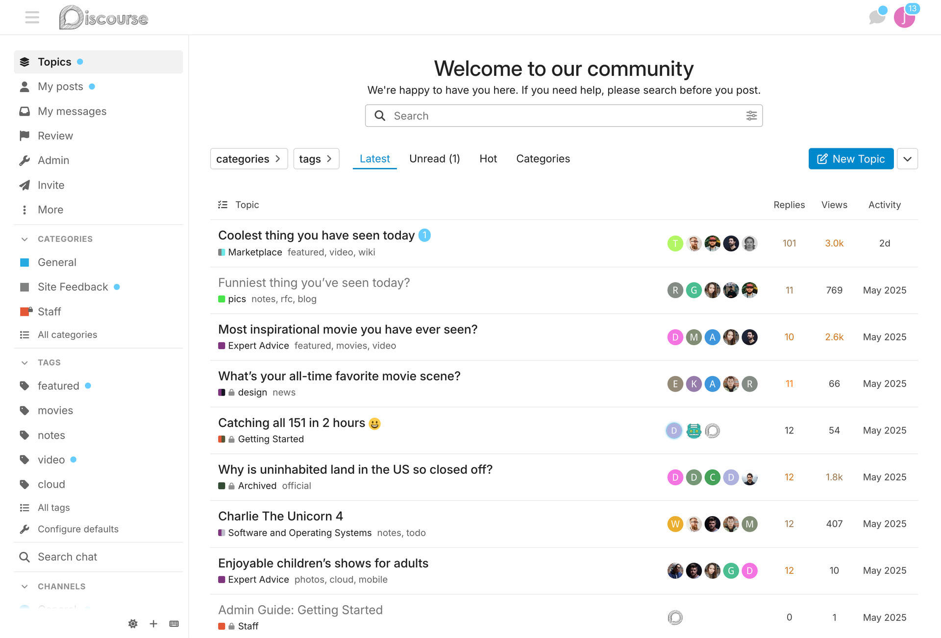
I think you didn’t mention that not only the font size of the table headers, but also the size of the numbers in the Replies, Views, and Activity columns, seem to be decreased.

I think the icon in the language dropdown is now very large in relation to the text.
Before:
image

After:
image

5 Likes

Thank you so much for the before/after. I thought it was missing from the OP.

Both these changes look weird: the after side looks much less contrasted and may cause A11y issues, or?

I’m heading to the new group for a test drive!

2 Likes

The word “link” in the topic map is only partly shown after I join the group:

Screenshot taken at Add link to sidebar category setting to new admin menu in categories section of the sidebar

And the text in this modal is difficult to read on hover. I think the contrast was better before

I’m really looking forward to the changes to the default style, when will it be released approximately?

1 Like

Search input and submit are squished!

squish!

edit : on mobile only

3 Likes

All great feedback / bug finding so far. Thanks for the updates.

4 Likes

This is a good callout. I think the new button style is quite nice as well, but for some reason in this section (with so many of them together), it doesn’t feel quite right.

4 Likes

The unread font weight is heavier than on read topics.
It didn’t strike me on desktop, but I see it on mobile.

It looks a bit blunt to me.

I liked that discourse mostly opted for just a color change, which felt more elegant than the canonical weight difference we see on many forum software.

Now we have both. The difference is subtle, yet I’d prefer only a color change :paintbrush:

3 Likes