The discussion revolves around the issue of the timeline not appearing on tablet devices at narrow widths. Initially, noisegratte reported the problem and zogstrip clarified that there’s no “tablet browsing” mode, only desktop or mobile view. noisegratte and zogstrip further discussed the issue, suspecting that the timeline might be hidden via CSS at narrow viewports.
After testing, noisegratte found that the issue occurs on iPads in portrait mode, and Frederic_Bertrand confirmed that it’s not just a width issue, but also device-specific. Frederic_Bertrand provided screenshots and further testing details, which helped zogstrip understand the problem.
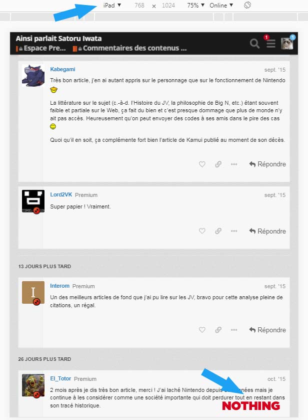
It may be a problem with iPad only, not just the 768 width. I tested with Chrome and Firefox previews, it’s the same.
As you can see, if you set the preview to iPad, you don’t va the mobile navigation option displayed.
If you set the preview mode to resposive, the mobile navigation appears.

 .