Hello Regis,
It may be a problem with iPad only, not just the 768 width. I tested with Chrome and Firefox previews, it’s the same.
As you can see, if you set the preview to iPad, you don’t va the mobile navigation option displayed.
If you set the preview mode to resposive, the mobile navigation appears.
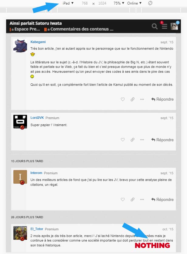

I checked and it’s the same thing on this forum.
And if you change from responsive to ipad without reloading the page, the mobile navigation stays until you refresh the page.
I hope it helps.