How do the `@import`'s work with SCSS?

Hi, didn’t want to spam the forums with multiple topics, so I have 4 major questions here as a newer Discourse forums user/member:

1) Is there a way to remove all traces of social media on my website?

I am not sure if it is built into Discourse or if it’s a theme-specific thing, but in the source code, there are 5 mentions of Twitter & a mention of FaceBook on each page if you View Source. They are:

<meta name="twitter:card" content="summary" />
<meta name="twitter:image" content="https://forums.mysite.me/uploads/default/original/1X/9c81453y45yh45ha81cedd21d3cf20.png" />
<meta name="twitter:url" content="https://forums.mysite.me/" />
<meta name="twitter:title" content="SiteTitle" />
<meta name="twitter:description" content="Site Description Is Here" />

And under <div class="hidden" id="data-preloaded" data-preloaded=, the mention of FaceBook is: \&quot;facebook_app_id\&quot;. My site is extreme privacy-focused, so those being on the site isn’t a good look.

Asked again in Remove All Traces of Social Media On My Website?

2) How do the @import’s work with SCSS? While trying to customize the Air Theme, I noticed on the GitHub page that there is CSS for the Desktop which is:

@import "showcased-categories";
@import "chat-desktop";
@import "sidebar-desktop";

So, I tried to make my own theme and include that in my theme’s Edit CSS/HTML → Desktop section, but when I went to save that entry, I got:


and I cannot for the life of me figure out how to make the @import stuff work. I even went into my VPS’ server of the Discourse install, made a folder called “scss” and put the files that, that code tries to import in there, restarted my forums and still wouldn’t work.

3) How can I have the forums automatically re-launch if my VPS server reboots? Server is Ubuntu 22.04. While researching, I found this reply on these forums here, but I did what it says and I must be blind because I don’t see instructions on how to do this on the install page like that comment suggests.

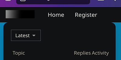
4) How can I move my entire forum down some? It looks fine on Desktop, but on mobile, it looks how it does at the top, in the comment below this post (since new users can only add 1 screenshot per post apparently), with the rounded edges hitting the top bar…

image

I tried adding a break tag (<br>) in the Head section of the theme’s CSS, but that moved everything down, including the top nav bar, which I want to stay at the top.

I think that is all of my questions for now. Thank you.

Regarding #4 above, this is the screenshot I was referring to:
Screenshot_20240325-160753_Firefox

Hi, welcome to Meta :wave:

  1. I don’t have an answer to your question. However, I could be wrong. I don’t think these OpenGraph meta and facebook_app_id are privacy issues here. :thinking: Hopefully, someone else can give a better insight on this.

  2. You did not create a remote theme. It lives in a GitHub repository. You can create your files, like splitting your CSS into multiple files in a scss directory. Then, the @import will automatically refer to this directory.

    You can’t do that when you manually create a theme in the Admin.

    If you want to customize a remote theme, you can create a Theme Component, attach it to the Air Theme, and add any CSS you want. This is not necessary to import these files. However, you might need to copy any SCSS functions/mixins if you need them for your customizations (for example, discourse-air/scss/sidebar-desktop.scss at main · discourse/discourse-air · GitHub)

    For more information about themes: Beginner's guide to developing Discourse Themes

  3. As Falco said, by default, if you follow the standard installation, Docker always starts on reboot. There is no instructions to find because that is the default behavior. Can you confirm that your forum hasn’t started on reboot?

  4. First, does everything display properly with safe mode enabled? Just to make sure this is not related to any customizations. That would be the first step in figuring out the issue.

1 Like

Thanks for the reply. For #4, I’m assuming it’s a CSS issue or something, which is why I’m unsure on how to add a gap so that the mobile site doesn’t look bad. With safe-mode on, it still happens (with the 1st option unchecked).

Regarding #1, they might not be “privacy issues” per-say, but I just don’t want any mentions of socials anywhere on it.

#2: Ah, ok, interesting…I did that with a component that I was editing about 5hrs ago, but didn’t know that’s how that worked for themes. Will try that out real quick.

Hm…my Docker didn’t automatically start once my VPS got booted up, strange.

1 Like

Hm. If more people follow this path, the forum will be spammed with unusable thread titles.

5 Likes

It would be best @Question42 if you could create one topic per issue. Not only does it make the topic titles much more relevant, but It also makes the topics much easier for people to weigh in on and a lot clearer for anyone searching for similar in the future. :+1:

3 Likes

2nd comment on the #2 point real quick:
So, I forked the Air theme, made my own changes, uploaded it to my own repository, installed it with the GitHub link in my themes section of Admin panel…but now I can’t access CSS/HTML since it is a non-local theme now. How do I work around this? Or do I have to do the component thing you mentioned?

There’s no way to edit local CSS/HTML with an imported GitHub theme? Because at least locally, I could easily edit the CSS/HTML in the Admin panel, but just couldn’t do the @import stuff. But now I did the remote thing you mentioned and can’t edit the theme to add the @import codes, which was the point of this. :sweat_smile:

Regarding #4:
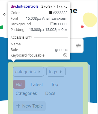
You could try adding a margin to the top for the .list-controls class.

// in mobile css
.list-controls {
  margin-top: 1rem;
}

image

So, the only mention of .list-controls in my mobile.scss file I have are:

.categories-list .list-controls {
  background: var(--secondary);
  padding: 0.5em;
  border-radius: 8px;
}

.list-controls .nav-pills {
  li.navigation-toggle {
    border-radius: 8px;
    border: none;
    background-color: var(--secondary);
    a:hover,
    a:focus {
      color: var(--primary);
      background-color: var(--secondary);
    }
  }

Which one should I I put your code in?

You could put it within the first selector.
Or another option would be that this part:

.list-controls .nav-pills {
  li.navigation-toggle {
    border-radius: 8px;
    border: none;
    background-color: var(--secondary);
    a:hover,
    a:focus {
      color: var(--primary);
      background-color: var(--secondary);
    }
  }
}

Can be rewritten as:

.list-controls {
  
  .nav-pills {
    li.navigation-toggle {
      border-radius: 8px;
      border: none;
      background-color: var(--secondary);
      a:hover,
      a:focus {
        color: var(--primary);
        background-color: var(--secondary);
      }
    }
  }
}

Then you can place new declarations that will only affect .list-controls before the .nav-pills part.

So I can add

.list-controls {
  margin-top: 1rem;
}

to make the whole thing look like this:

.list-controls {
  margin-top: 1rem;
  
  .nav-pills {
    li.navigation-toggle {
      border-radius: 8px;
      border: none;
      background-color: var(--secondary);
      a:hover,
      a:focus {
        color: var(--primary);
        background-color: var(--secondary);
      }
    }
  }

?

That’s right! Although look like it needs one more } at the end.

So, this is what it gives me on mobile:

Unfortunately, it made the Top/Reply/Activity bar/area not touch the posts anymore and the “Latest” tab is now touching the top. Can we somehow make the Top/Reply/Activity area still touch the post area but the “Latest” drop down box not touch the top bar?

Even though it was from being messed up, the “Latest” area looked good merged with the Topic area as shown in original screenshot:

98e4a9a087bd8bd4155fcf5fcf4ecfb4aa778378

EDIT: Oh boy…had a friend check site on their phone (iPhone 13) and the site looks ruined now on their phone, lol…uhhh :sweat_smile: But looks “fine” on my phone (screenshot above, minus the fixes I want). Looks like regular mobile view is fine on their phone but desktop mode on phone makes it all messy

Hmm, it’s hard to tell what other styles are affecting your theme. I’d recommend taking a look at this guide if you haven’t already, particular the parts that show using the browser’s inspector (in the Dev Tools – accessed with F12 in Chrome). It lets you see what styles of being applied to each element and toggle them on and off to see the difference in realtime.

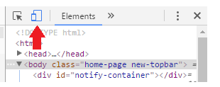
Since it’s related to the mobile view, you can emulate mobile on your desktop from most browsers. Here’s what the button looks like in Chrome:
image

1 Like

That would be expected, no? Desktop mode isn’t really intended for mobile devices.

1 Like