Proposing a left-aligned slide out hamburger menu

I’m just really disappointed that in iPhone, when you’re designing an app you can do whatever you want with swipe left/right, and it’s only bottom/top swipes that are reserved for system menus/escape hatches.

It’s very difficult to get app-like parity when users are used to horizontal swipes opening menus. Android browsers are able to achieve this gesture parity and feel more native app-like because the browser’s “back” function is a button, rather than a gesture. Left/right swipes are free to be used by the webapp, just like an installed app here.

It’s something to work around certainly since iPhone users have gotten used to side-swipe to back/forward in a browser, but I hope you can understand my reasoning for being miffed about it.

3 Likes

Yes. Apple’s attitude toward PWA’s is downright infuriating, and refusing to allow gesture support is just another example in a long list.

1 Like

Sort of, I’d argue that taking away swipe left to go back (in terms of web browsing, anyway) is quite user hostile as well. I don’t think anyone is “right” here, there’s just different behaviors that people may prefer… or not prefer…

I do feel very confident that those classic (and awful) dedicated Android screen buttons are going to die a painful death over the next few years. So any behavior that requires those “mandatory” buttons present is cruisin’ for a bruisin’

7 Likes

Well, that’s the deal: you’re the consumer, Apple is the designer. There’s no way around it. They. Know. Better. Proof? They are Number One. People die for them. Literally.

No, I’m not an iPhone user, and yes I do want what @featheredtoast has been cooking on my Android device :kissing_closed_eyes:

This is live in Meta for testing for a few moments.

4 Likes

Love it. Seems strange that the button is on the right and it slides in from the left.

Edit: Ah, I see that there are two. One on right is the right-most button. Makes sense.

4 Likes

Slides in from the left on mobile, for responsive desktop it slides in from the right - intentional?

2 Likes

yes that’s intentional. The slide animations on responsive desktop were the only change to desktop - otherwise it remains untouched.

Mobile was the big target for the wild let’s add swipe functionality, full height and shift the menu to the other side of the screen changes.

5 Likes

and it’s gone.

We just merged Font Awesome 5 so we are back to the master branch here in Meta.

9 Likes

@featheredtoast any plans to add this feature in upcoming releases ? how can we test this ?

Don’t worry! It’s gonna happen in a future release, but needs planning, polish, and review. :slight_smile:

These things will all happen soon

9 Likes

We’re live with this on meta again for the moment.

13 Likes

Sooo nice!

7 Likes

Having the menu pop out from the side of the screen opposite the button feels a tad - inconsistent.

5 Likes

Especially when compared to the desktop where everything is on the right! There’s no consistency among the platforms.

1 Like

Loving the work here guys.

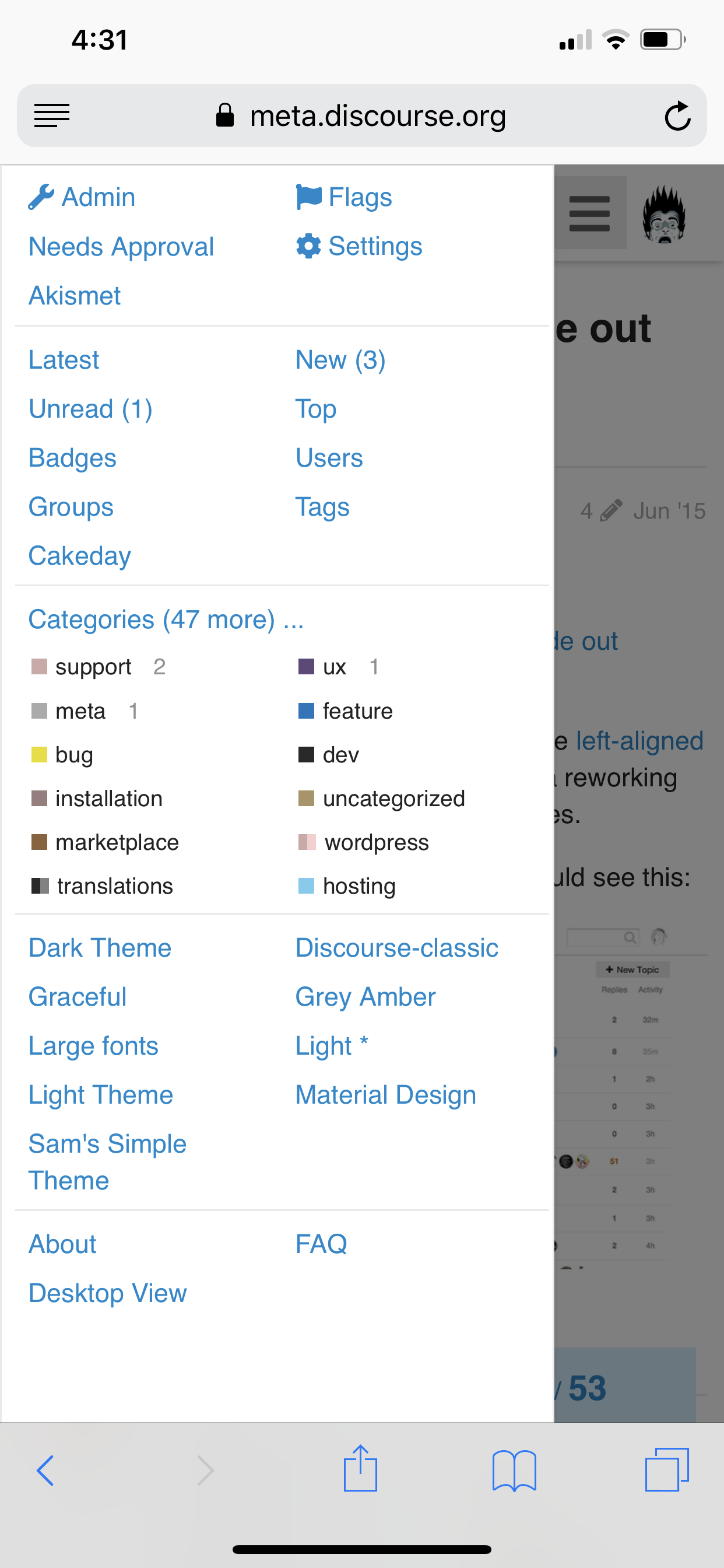
One inconsistency I noticed was that if I view the user menu by pressing my avatar - as we usually do, I can no longer press the avatar again to dismiss the user menu I have to swipe.

So if I’m not a swiper and I press the user avatar I seem to have to swipe to remove it. A function of the lovely full height menu I guess.

It feels like I should be presented with either a swipe to view, swipe to hide OR press to view press to hide interface - not a mixture.

2 Likes

Is this compatible with RTL websites?

1 Like

Fun design but not personally a fan:

  • the current design is intuitive and mirrors the way desktop works.

  • when ‘swiping’ I fear that I’m going to hit and activate a control rather than swipe the menu back

  • don’t like the menu coming from left as for wider screens harder to reach with thumb

  • to switch between the menus is one extra step on mobile (need to swipe away first). This is an issue if user is exploring to find a feature.

I believe Discourse had already nailed some of these things, why reinvent?

Would prefer this optional if at all possible.

Unlikely. It does not make sense to use only 80% of the vertical space on the XS Max (which I also own) when we can use 100% of it.

I get what you mean, the earlier workflow was to simply:

  • tap to see, tap to hide

You can try getting used to tapping the area that is unused by the full-height menu. That would always close the menu without a swipe action.

This is especially more convenient when using your phone with both hands :open_hands:

10 Likes