mcwumbly
November 2, 2022, 3:02pm
82
@awesomerobot and @tgxworld just merged this pull request, which I think should address some of the above feedback:
main ← exp-sidebar-badges
merged 11:55AM - 02 Nov 22 UTC
This updates the behavior of the list destination setting for links in the sideb… ar.
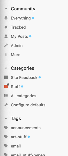
By default, new/unread content will show a dot like chat, rather than the count of new/unread topics.

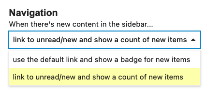
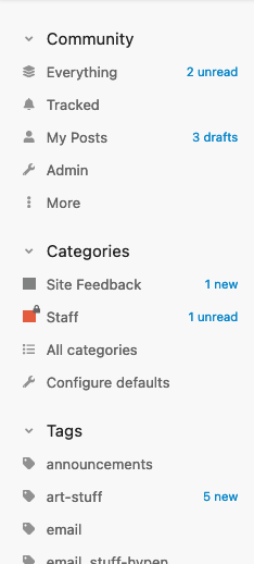
If a user chooses to link to new/unread in the sidebar, we'll show the count.


The goal here is to find a simple default for typical users (new/unread indication, no counts, default links) while providing a different workflow for power users (showing new/unread counts, and linking directly to new/unread).
💬 /t/82626
Now when using the default user preference, you see this:
And when you use the “power user” preference, you see this:
So, casual users have a bit less noise in their sidebar, and for everyone, what you see in the links is now more consistent with what will happen when you click them.
4 Likes


