Hi guys,
Users of our forums tell us that tablet browsing has disappeared (since version 2.4?). Is this a bug or did we miss a configuration?
Navigation is present in desktop view
and in mobile view
.
The problem is also present on this forum.
Thanks in advance.
noisegratte:
tablet browsing
There’s never been such a thing as “tablet browsing”… It’s either desktop or mobile view.
Hi Regis,
Thank you for the correction. The problem remains the same, we do not have navigation on tablet devices
I see, you mean the timeline isn’t showing up in some tablets? I think we’re hiding it via CSS when the viewport isn’t large enough.
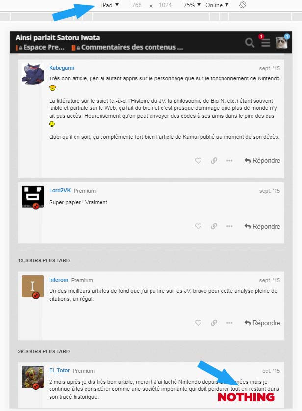
It breaks on iPad (resolution 768x1024) in portrait mode. Seems to be ok in landscape mode. Tested with Firefox Adaptative preview.
Yeah I don’t think there’s enough room in portrait mode.
Hello Regis,
It may be a problem with iPad only, not just the 768 width. I tested with Chrome and Firefox previews, it’s the same.
As you can see, if you set the preview to iPad, you don’t va the mobile navigation option displayed.
I checked and it’s the same thing on this forum.
And if you change from responsive to ipad without reloading the page, the mobile navigation stays until you refresh the page.
I hope it helps.
Thanks @Frederic_Bertrand , I now understand the problem
There are cases where neither the topic timeline nor the topic progress is shown. That’s indeed bad.
@nbianca can you have a look at this?
nbianca
March 12, 2020, 11:48am
11

 .
.
