Have you made sure to follow all of the steps outlined in that component? You also need to enable a dark theme needs to be at: /admin/site_settings/category/basic?filter=dark
I haven’t had an issue with this, even with sidebar enabled.
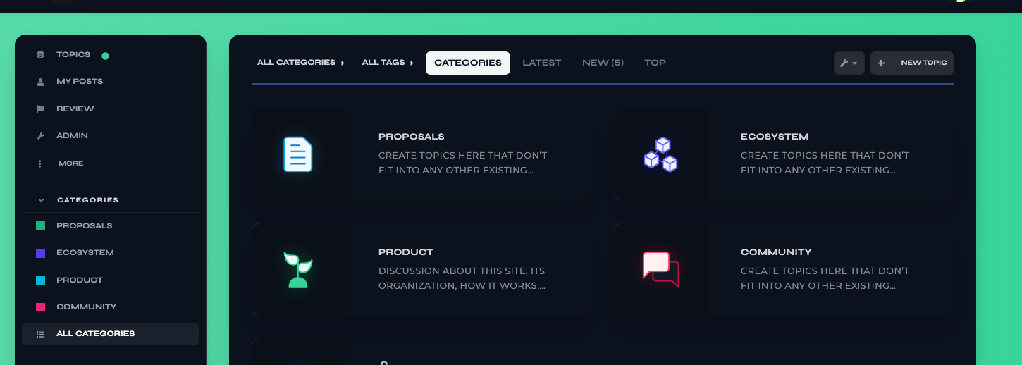
Unfortunately no, there isn’t a way to change this. Would it be possible for you to label them as 01, 02, and so on? Without the world module attached?
The dimensions are 132x132.
Would you mind sharing a screenshot of what is happening here? I havent noticed this on my demo site.
Thanks for the explanations and help here! I didn’t realize there was an extra component for the Dark/Light. I can figure out a way to make the module numbers more clear, perhaps adding an image to replace the text default. Your suggestion of 01 is good too.
Before, I was able to see at least 2x more of this image. When I started the day (even before adjusting the theme) the image was reduced in size, so it seems it was an update that caused it? Even if I upload a file per your suggested dimensions in another post above (1920x1080) it still does this stretching thing.
I did follow all the instructions on how to set the search banner. It is set below site header as required. I removed the text, yes. But previously there was also no text and it showed much more. It still only shows a sliver of the image. I uploaded the image as background to the search banner, not in the theme component.
This is how I had it setup before I made any changes, and even this morning before I changed everything the image appeared much more cut off than it had previously, which is why I suspect an update has caused it. At this point, I’m only seeing maybe 1/4 of the image at most.
I also tried editing the theme component to recreate this, but the image was very pixelated when I did that. Not sure why it starting doing this today. I also noticed today many of my other theme details were off, so perhaps it’s just a buggy day. That’s what prompted me to try a new theme, this one. In the end, not a big deal I can make a new image that works better. Just curious as to why there’s such a big difference all of a sudden.
I’m experiencing the same where the background on mobile is inconsistent with the desktop, making things unreadable. It basically makes it unusable on mobile under certain scenarios.
I appreciate the effort and work on this theme however it’s a shame this inconsistency is being treated as some sort of feature rather than a bug despite it being raised many times. I will certainly start using it if this can be sorted out.
UPDATE
I think it’s just the discourse-docs plugin that has the above issue. I’m not sure how this can be sorted out though, ideally it would be nice to have the discourse docs working well with theme this as they’re both nice features for the forum.
I just tried installing the Air Theme on a new Discourse site. On my site there is a background color being set for various elements that fixes the readability issue you are finding:
If I use a desktop browser and reduce the screen size I can see my layout is consistent with yours, whereas on a mobile device browser, I don’t have the same structure. For example, it only shows ‘latest’ as a dropdown… which makes me think yours isn’t being detected as a mobile which is why the theme isn’t being ‘buggy’ like my mobile examples above?
Yes. I’m testing mobile mode on my desktop by adding the ?mobile_view=1 parameter to the URL. The results should be the same as what you get on a mobile device. I’m definitely being served the mobile view in the screenshot.


