Seems to be fixed in DEV: Prep for pre-topic-list-refactor (#6) · discourse/discourse-simple-theme@b305d81 · GitHub
verified the pr was committed in my install - works like a charm 
Hi, thanks very much for this traditional theme, it’s much closer to what my migrated legacy forum users would expect!
There appears to be a small bug in the “Suggested Topics” list when clicking on the avatar of the last post user; the user profile briefly appears for a few milliseconds and then disappears.
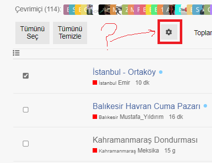
Hi there, another bug is that the cog button doesn’t appear for bulk actions with Sam’s Simple Theme (it does with the Discourse default one):
Hi there, are pull requests being accepted for this theme? I submitted a PR a few days ago with a simple 2 line fix for a fairly significant bug that is breaking links to user profiles.
This PR has been merged. Thank you for the fix ![]()
Hi there, one of the biggest improvements in this theme is the elimination of the posters column from topic lists, and it simply shows the original poster and the latest poster. However, this paradigm falls apart in the list of private message topics. When the user is both the starter and the latest poster in a PM topic there is no indication of who the other recipient(s) is/are. So it feels like specifically for the PM topics list the default Discourse theme’s posters avatars column needs to be used. Is there a clean way for me to add it back with a theme component until this gets fixed in the official code of Sam’s Simple Theme? Thanks!
I’m pretty sure that this is a new regression, in desktop browser mode the latest poster avatar pops up partially off-screen:
Hm, I’m unable to reproduce ![]()
As a side note, this user card modal is from this theme component: Usercard Redesign Experiment
@Arkshine Hi, appreciate the reply. I think it happens when the zoom level is higher. I first noticed the issue on Firefox, where I have the default zoom set to 110%, and also layout.css.devPixelsPerPx set to 1.1 . But I can also reproduce it with Chromium’s default settings by just zooming in a bit (it appears to only happen when the browser is maximized):
Ah, ok. I think I’ll cross-post this issue there. It seems like the usercard component should take care of its own CSS to avoid appearing off-screen. But the issue is complicated by Sam’s Simple Theme, which has the user card closer to the right edge.
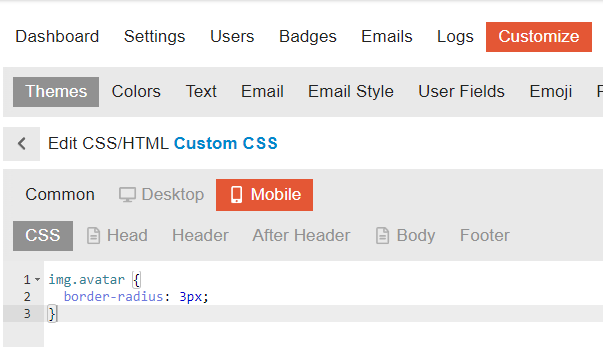
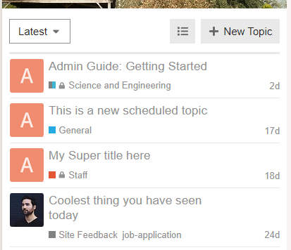
How can you make avatars square in mobile view?
You can add the following CSS in a new theme component:
img.avatar {
  border-radius: 3px;
}


Adjustment button in frame not visible

It looks like the category headers for this theme are missing translations:

Possibly related to DEV: Fix locale file location (#19) · discourse/discourse-simple-theme@62ca149 · GitHub?
I have just updated this on my self hosted and noticed the same
![]()
very helpful!@_@
Thanks for the reports, @Jaypes and @scog. A fix was merged earlier and I’ve just updated the theme. Looks like it worked!
I can confirm this has been fixed in the latest update. Many thanks!


