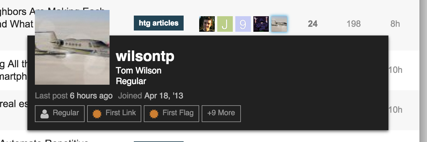
User card overflows outside of window

AI-generated summary

The discussion revolves around an issue with user cards overflowing outside of the window. chapel shares a screenshot and identifies a GitHub commit (246f77c98d48df011a2e80ae5d33bee1104b6366) that causes the issue and proposes a fix in a PR (#3205).

chapel and sam discuss the issue, with sam suggesting that the original change was made to address rendering issues in certain browser widths. chapel shares screenshots of the current behavior and the behavior when using the overage variable.

sam agrees to pull in the proposed fix, and chapel shares additional context about how they encountered the issue while modifying the minimal theme.

The discussion takes a humorous turn with DeanMarkTaylor and codinghorror sharing unexpected images, and DeanMarkTaylor sharing an image of codinghorror and sam.

I’ve tracked down the change that causes the issue, not sure why it was changed here:

https://github.com/discourse/discourse/commit/246f77c98d48df011a2e80ae5d33bee1104b6366

I tested it on my install, reverting the above change, using the overage variable like it was before, causes the user card to display properly.

My question for @sam is why change it?

PR for fix:
https://github.com/discourse/discourse/pull/3205

1개의 좋아요

It was rendering offscreen in certain browser widths afaik.

That makes sense, as to why the original solution wouldn’t work. Though what you changed it to definitely didn’t fix the issue.

Do you know what browsers it was having trouble with? I can modify my fix to accommodate those browsers.

Can you test this on a site with a custome header like https://discuss.howtogeek.com/ at various widths. I think chrome exhibited the issue at very particular widths.

Current behavior

Using overage

Window width: 854px (was lowest width to have multiple users in users column)

I also tested in Firefox and Safari and the behavior was consistent, for what it’s worth.

I will pull this in and keep an eye on it, thanks!

1개의 좋아요

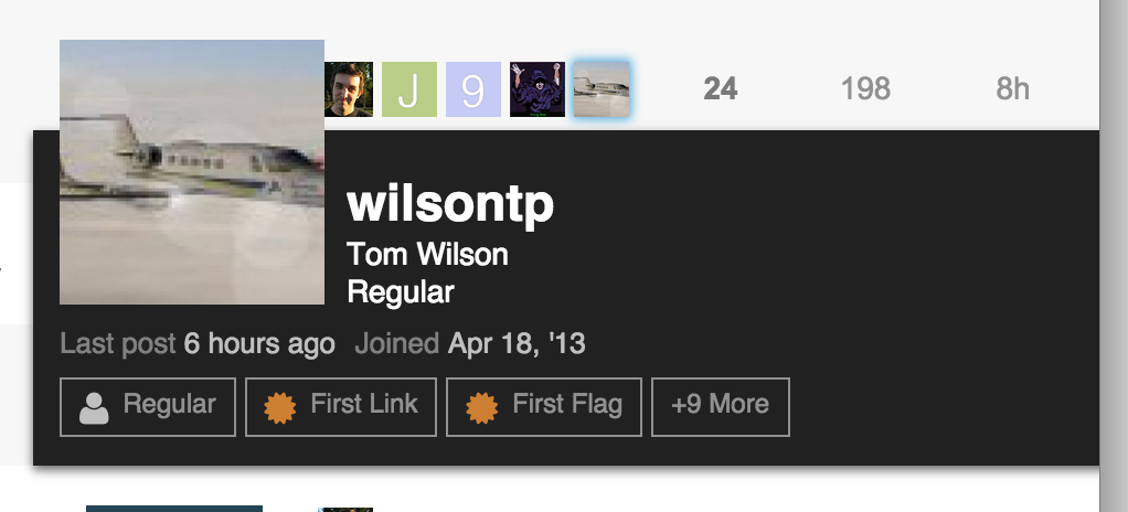
As an FYI, I found the issue after adding the user card markup to the last poster info on my version of the minimal theme. Since the last poster is on the far right, it was always going over the edge.

1개의 좋아요

Wow - damn - there’s a bloody big picture of me.

That was unexpected!

1개의 좋아요

Reminds me of the poster I have in my bedroom :kissing_smiling_eyes:

10개의 좋아요

Here’s one of @codinghorror and @sam talking

10개의 좋아요

This topic was automatically closed after 61 minutes. New replies are no longer allowed.

1개의 좋아요