며칠 전부터 태블릿의 Firefox 앱으로 이 포럼을 사용할 때 경험이 훨씬 나빠졌습니다.
Firefox 134.0 (Build #2016064983)
Android 14
Galaxy Tab S9 FE
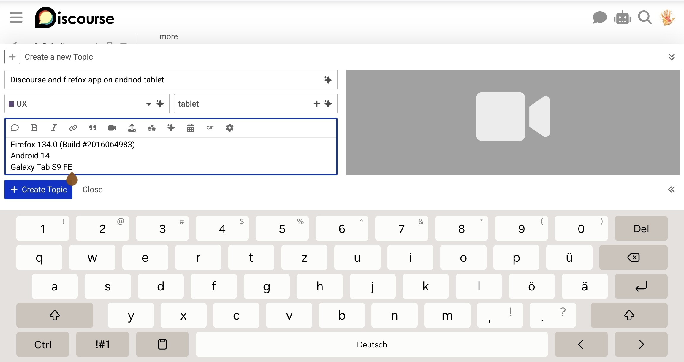
추가 참고 사항: 저는 항상 Firefox에서 Discourse를 사용할 때 “데스크톱 사이트” 옵션을 비활성화 상태로 사용했습니다. 그렇지 않으면 글꼴이 너무 커집니다. 크기 차이를 보여주는 영상:
매우 쉽게 설명할 수 있는 한 가지 회귀(regression) 현상은 AI 메뉴가 작성기(composer) 뒤에 열리다는 것입니다. 운이 좋으면 거의 모든 옵션을 볼 수 있지만, 때로는 하나만 보이거나 아예 보이지 않습니다. 새 주제를 만들 때 후자의 경우인데, 제목과 카테고리 필드도 메뉴를 가리기 때문입니다.
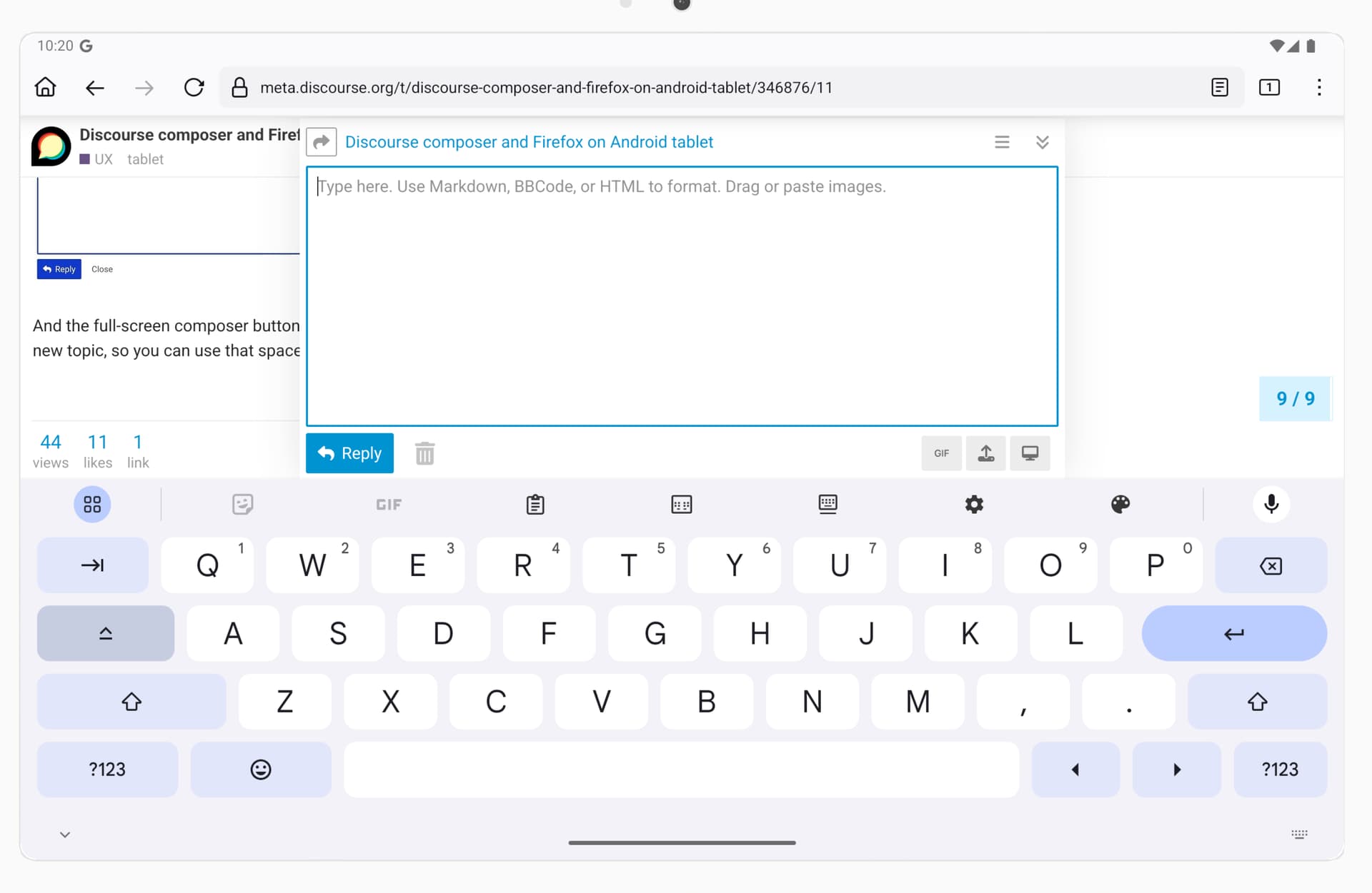
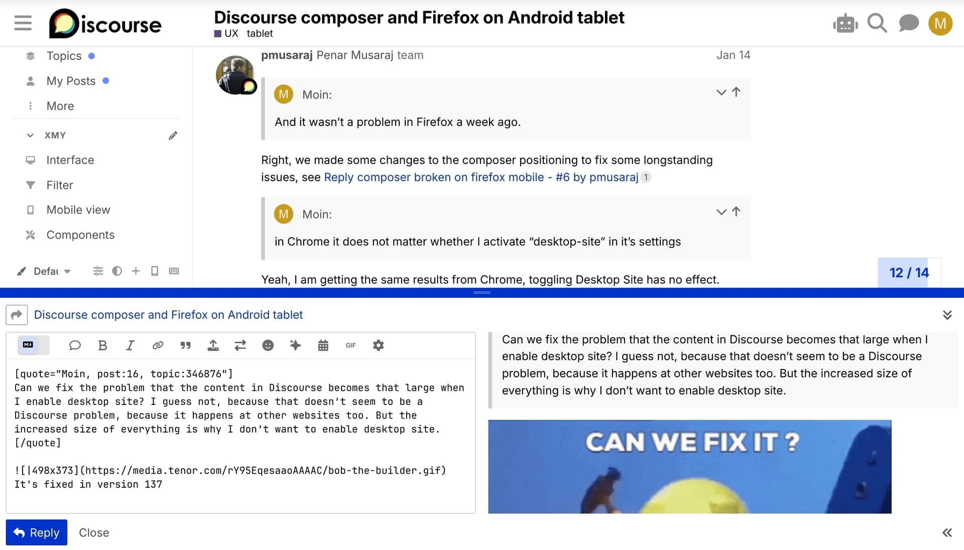
또한, 이제 작성기의 높이를 조절할 수 없습니다. 전체 화면 버튼과 그립(grip)이 사라졌습니다. 이로 인해 인용(quoting)과 게시글 링크 작업이 훨씬 복잡해졌습니다. Firefox 설정에서 "데스크톱 모드"를 활성화하면 그립이 다시 나타납니다. 하지만 앞서 설명했듯이 모든 요소의 크기가 매우 크기 때문에 이는 해결책이 되지 않습니다. Chrome에서는 "데스크톱 사이트"가 활성화되어 있든 비활성화되어 있든 그립이 보입니다.
이제 작성기의 높이는 미리보기가 표시되는지에 따라 달라집니다. 미리보기가 표시될 때 양쪽 방향으로 더 커집니다. 오른쪽에서 미리보기를 활성화하거나 숨김으로써 선택할 수 있는 두 가지 고정 높이 옵션입니다. 따라서 인용을 위한 해결책으로 미리보기를 숨기는 것이 작동합니다.
하지만 작성기에 겨우 3줄만 보이는 상태에서 주제를 작성하는 것은 꽤 어렵습니다. 미리보기를 표시하면 작성기의 크기가 커지는 것처럼 보이지만, 이는 텍스트 필드를 탭하여 키보드가 나타날 때까지만 해당됩니다. 그 작은 필드 내에서 스크롤하여 다른 단락으로 이동하는 것도 어렵습니다.
감사합니다. 네, AI 드롭다운의 문제가 무엇인지 파악했습니다. z-index 관련 문제입니다.
@keegan@awesomerobot 이 부분에 도움이 필요합니다. 태블릿, iPad, 모바일에서는 컴포저가 열려 있을 때 mobile-composer의 z-index를 설정하고 있습니다. 이는 컴포저가 헤더 위에 겹쳐지도록 하기 위함이며, 특히 태블릿의 가로 화면에서 중요합니다.
하지만 AI 헬퍼 메뉴의 z-index는 더 낮습니다(단순히 z("composer", "dropdown")보다 약간 높은 수준)로, 태블릿에서는 컴포저 아래에 표시됩니다. 모바일에는 영향을 주지 않는 것 같고, 모바일에서는 버튼이 모달 창을 트리거하기 때문입니다. 태블릿에서도 모달을 사용하도록 변경하는 것이 적절할까요?
저는 데스크톱 모드에서 Discourse를 사용하고 있습니다. 사이드바의 토글 버튼에는 전화기 아이콘이 표시되고, 작성기 옆에 미리보기가 보이며, 작성기 하단에 GIF나 이미지를 추가하는 버튼이 없습니다.
하지만 앞서 말씀드린 대로, 그렇지 않으면 모든 요소가 너무 크게 표시되므로 Firefox에서 “데스크톱 사이트” 옵션을 비활성화한 채로 사용하고 있습니다. 그러나 Chrome에서는 설정에서 "데스크톱 사이트"를 활성화하든 아니든 관계없이 작성기 크기를 변경할 수 있으므로, 이것이 문제가 될 것 같지는 않습니다. 또한 일주일 전에는 Firefox에서도 이런 문제가 없었습니다.
네, Chrome에서도 동일한 결과를 확인했습니다. 데스크톱 사이트 토글을 켜고 끄는 것이 아무런 영향을 미치지 않습니다. 해당 토글을 켜고 끄면서 사용자 에이전트를 검사해 보니 Chrome에는 미묘한 차이가 있지만, 중요한 점은 어떤 모드에서도 사용자 에이전트에 Mobile이 포함되어 있지 않다는 것입니다.
데스크톱 사이트 옵션을 활성화했을 때 Discourse의 콘텐츠가 이렇게 크게 보이는 문제를 수정할 수 있을까요? 다른 웹사이트에서도 같은 현상이 발생하기 때문에 Discourse의 문제는 아닌 것 같습니다. 하지만 모든 것이 커지는 것이 데스크톱 사이트 옵션을 활성화하고 싶지 않은 이유입니다.
참고: 데스크톱 사이트가 활성화되고 Chrome을 사용하는 경우, 전체 화면 작성기 버튼도 사라집니다.
Discourse는 제가 오른쪽 하단에 버튼이 있는 모바일 작성기를 볼지, 옆에 미리보기가 있는 데스크톱 작성기를 볼지를 어떻게 판단하나요? 미리보기의 데스크톱 버전을 보고 있으므로, Firefox에서는 해당 감지가 제대로 작동하는 것 같습니다. 높이를 변경하는 옵션에도 같은 기법을 사용할 수 있을까요?