少し遅くなりました  ですが、誰かの役に立つかもしれません。注意点として以下を挙げます:
- すべての CSS コードが必要というわけではありません。特に表の行の境界線や背景色などは、お好みに合わせて調整してください。
- 通常の表からフレックスボックスレイアウトに変更しました。表の行には負の余白を設定できないなどのレイアウト上の問題があるためです。それに、より柔軟性があります
- Category Group 1 と Category Group 2 を、希望するカテゴリグループ名に置き換えてください。
- 例ではカテゴリ ID の 2 と 4 を使用しています。Chrome の開発者ツールで要素を検出(下の画像参照)し、適切なカテゴリ ID を見つけてください。その後、例の
[data-category-id="2"]と[data-category-id="4"]をご自身の ID に置き換えてください。

これを「Common」タブに貼り付けてください:
.category-list{
    display: flex;
    flex-direction: column;
}
.category-list thead tr{
    display: flex;
}
.category-list .topics {
    width: 95px;
    margin-left: auto;
    min-width: 95px;
    white-space: nowrap;
}
.category-list tbody tr {
    background-color: var(--primary-very-low);
    box-sizing: border-box;
    display: flex;
}
body .category-list [data-category-id="2"],body .category-list [data-category-id="4"] {
    position: relative;
    margin-top: 50px;
}
body [data-category-id="2"]::before {
    content: "Category Group 1";
}
body [data-category-id="4"]::before {
    content: "Category Group 2";
}
body [data-category-id="2"]::before,body [data-category-id="4"]::before {
    position: absolute;
    top: -35px;
    left: 0;
    font-weight: bold;
    font-size: 15px;
    text-transform: uppercase;
    color: var(--primary-medium);
}
これを「Desktop」タブに貼り付けてください:
.category-list tbody tr {
    margin-bottom: 15px;
    border: 1px solid var(--primary-low);
}
そしてこれを「Mobile」タブに貼り付けてください:
body .category-list-item.category .posts {
    width: auto;
    margin-left: auto;
}
body .category-list-item>footer,body .subcategory-list-item>footer{
    background-color: var(--primary-very-low);
}
.categories-list .category-list th {
    padding: 0;
}
.category-list-item>footer .category-stat, .subcategory-list-item>footer .category-stat {
    float: right;
}
.category-list-item>footer .category-stat:first-child, .subcategory-list-item>footer .category-stat:first-child{
    margin-right: 0;
}
body .category-list-item.category tr:first-of-type{
    padding: 10px 0;
    border-bottom: 1px solid var(--primary-low);
}
body tr.category-topic-link:last-of-type{
    border-bottom: 1px solid var(--primary-low);
}
body .categories-list .category-list th {
    padding: 0;
}
body .category-list-item {
    border-top: none;
    margin-bottom: 10px;
}
body .category-list-item {
    padding: 0;
    border: 1px solid var(--primary-low)!important;
}
.category-list-item>footer, .subcategory-list-item>footer {
    border-top: none;
}
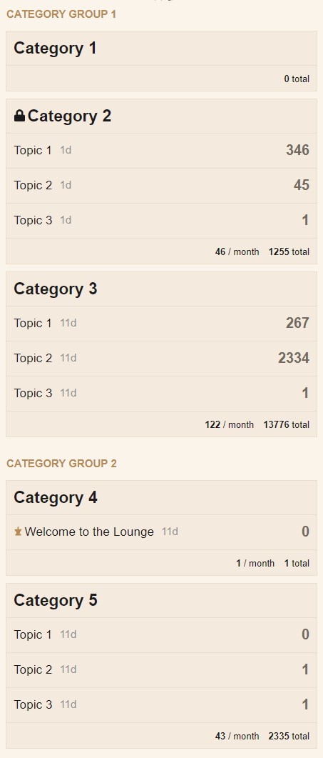
これがデスクトップとモバイル環境での表示例です: