Se un argomento recente ha molte risposte, la riga dell’argomento è più grande dello schermo (vedi la prima schermata, riga “Citazione del giorno (da non-utenti)”.
Tutti gli elementi diversi sono molto alti e vorrei renderli più corti.
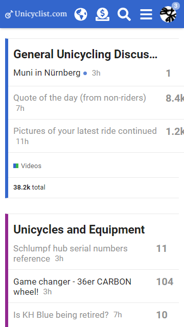
Ecco come appare attualmente la mia riprogettazione. Ho anche spostato il numero degli argomenti accanto al nome della categoria e l’elenco delle sottocategorie sotto la categoria principale invece che sotto l’elenco degli argomenti:
Dato che sembra che il template mobile per l’elenco delle categorie sia stato modificato in un aggiornamento non identificato di Discourse, e poiché avevo sovrascritto il template (che utilizzava codice ormai obsoleto), mi sono ritrovato con del codice che non veniva più interpretato, come {{i18n "reports.all_time"}} o {{18n "all_time"}}.
Non sono riuscito a capire come risolvere il problema, quindi ho deciso di rimuovere queste informazioni.
Tuttavia, ritengo che il mio template mobile appaia ancora più gradevole e che queste informazioni statistiche (numero totale di post, numero di risposte…) non fossero necessarie nella visualizzazione mobile della pagina delle categorie.
Non ci sono grandi cambiamenti, ma ecco com’è ora:
Ne sono soddisfatto e spero che possa ispirare altre persone a migliorare la visualizzazione mobile della pagina delle categorie (molte pagine di Discourse si visualizzano molto bene su smartphone, ma quella predefinita delle categorie mi sembra decisamente fuori posto).
Sono d’accordo che la pagina delle categorie per mobile potrebbe aver bisogno di qualche miglioramento, ma mi chiedo anche se valga la pena avere un layout speciale per le categorie su mobile… Dovremmo usare gli stessi template per desktop e mobile e assicurarci che siano responsive? A me sembra un lavoro più prezioso… ma sarei interessato a sapere cosa ne pensano gli altri.