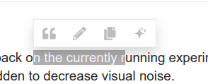
This topic is to collect feedback on the currently running experiment where the text in the text selection popup menu is hidden to decrease visual noise.
Something feels a bit too muted now, perhaps we darken the icons a bit given everything is smaller now?

Also perhaps we only do this if there are lots of actions? If all you have is quote having the text makes sense and space is not a problem?
Those icons are very small on mobile. In the image I compared them to the composer buttons and the composer AI helper. You can also notice the like link … in the background. They are also larger.

And I really had trouble remembering the AI options. If I remember correctly it was “translate to English” and “explain”. But that is very difficult to tell from the symbols.
Thanks! They do need to be larger for sure.
This is actually a separate thing. The AI Menu has been pushed back to be revealed on click.
On my phone, clicking on the AI sparkles brings up a submenu with only icons in as well (no labels).
Also, the icon for ‘Quote’ in the hover menu is the same as the one for blockquote in the composer rather than the speech bubble ‘full quote’ has in the composer.
Just adding my screenshots
The symbol for “Quote” did not change. It was always the same as blockquote. But I think most users are more used to that than the speech bubble. I don’t think that one is even part of the discobot tutorial.
Just finished making some adjustments based on the recent feedback.
Yeah, I think it just emphasises the ‘two functions, one icon’ more with the hover menu being icon-only. I’ve known quite a few new users on another (less tech-savvy) forum get turned around with the blockquote one in the composer thinking it was going to quote the reply. The quote symbol does feel like it’s suited to ‘quote’ rather than blockquote.
I think it’s a great idea for advanced users. However it probably better to show the labels for new users to teach them what those buttons functionality. It’s going to be a kind of guide to help use correctly these for the first few times.
(Wrote that yesterday, but forgot to publish)
I like that idea. When you aren’t logged in, the share button is also the only one that is shown.
It would also be cool if the description disappears after you’ve used the button x times and have become familiar with its function. But then, still, all buttons would appear with their description at the beginning.
Another interesting thing to think about… what about “Text only” like Apple? I guess there is a reason why they went down that path.
Perhaps we should do a quick survey of how this is implemented in other platforms?
Slack

- Dark toolbar - very high contrast
- Very nice tooltip (like floatkit I think)
- Seperator lines
- Icon only
Notion

- Light toolbar - high contrast
- Very nice tooltip (above like Slack)
- Icons only
Medium

- Dark toolbar - Very high contrast
- No tooltip
- Icon only
Overall things stick out are … better contrast and better hover state (no blue hover, instead a grey background) and nicer tooltip… we should try this…
Also … we should do another different experiment for this, now that we have an AI button

Yeah we compiled a good bit of select text examples online and on operating systems. Apple does use a text based system, but most text based web apps like notion, slack, etc use icons. Very specifically they’ll use text but it’s 90% icons.
I like the look but I dont think I would like this in practice. I quote things a lot (probably on average 10+ times a day) and I like how the button to quote is bigger than the others. If this is in core would it be possible fro the user to make one button bigger than the rest?
Where have we landed here? Only hide text if more than how many buttons?
If 3 buttons or more are present we hide the text.
Not objections from my part to merge this, I think it is OK… @mcwumbly ?
As an user I would suggest 4 or more and texts are hided ![]()
![]()
Now I understand why I had the impression that you were changing something all the time. I did not notice the pattern of when some icons were explained and when they were not.
But somehow, this does not fit with my experience. It seems like it is 4 or more options (or AI is not included). When I’m able to edit the post, there are 4 options so the text is hidden. But on other posts, there are 3 buttons, so “quote” and “copy” show the text. Why is there no AI text next to the star?


I would prefer if the menu worked the same way, irrespective of whether I am able to edit that post or not. At the moment, it feels like opening a surprise egg; I never know which version will show, because not only my posts have the menu without text but also all wikis.
Hmm. I could be wrong in my memory. Maybe if it’s there are more than 3.
Yeah, not having the “AI” text and having “Quote” and “Copy Quote” is super odd, we need to fix this prior to upstreaming.
Either nothing has titles or everything has titles, 33%/66% does not make sense.


