That is actually my intention, will live with it for a bit and see how I feel.
On my variation I use the standard category helper which by default has a fatter color bar as you can see in my screenshot. I am not 100% sold on the fat one, but the thin one is also not right either. Between the two though, I prefer the fat one, if only to be consistent with its usage elsewhere on the site.
I suggest you try it with different shades of (lighter, as you prefer :)) gray, it could work?
This should definitely be the new default design. The other one can be shipped as optional - code named “clown barf” or similar… ![]()
5 Mi Piace
Sam - Just wanted to congratulate you on this effort. Its very hard to make things simple - but this is much needed. I’ve been working with a developer on the same issue - so this is a welcome development.
"As the late Steve Jobs once explained, “When you start looking at a problem and it seems really simple, you don’t really understand the complexity of the problem. And your solutions are way too oversimplified. Then you get into the problem, and you see it’s really complicated. And you come up with all these convoluted solutions….That’s where most people stop.” Not Apple. It keeps on plugging away. “The really great person will keep on going,” said Jobs, “and find…the key underlying principle of the problem and come up with a beautiful, elegant solution that works.”
No - I don’t use it either. I think its probably rarely used in general.
I know I must sound like a broken record, but please please please let’s not mess up and provide way too low color contrast in any new UI’s. (I realize category colors can be chosen but things disappearing into the background does not make an accessible UI.) Those with less-than-perfect vision (and W3C standards adherents) thank you all. ![]()
4 Mi Piace
Keep in mind, this is my design which is very focused around me for now. If we ship a second theme (which I think we will some time next year) we will make sure to account for that or at least add a “high contrast switch”
1 Mi Piace
The table header style is starting to get on my nerves, too much grey there, is there a better style you can think of?
I was thinking that as well. It stands out too much against the list.
I like the subdued look of the default header, I wonder if we changed it to be more like the default table header.
Something like this?
5 Mi Piace
I like that better, but I wonder if its necessary to have it at all?
1 Mi Piace
To a certain degree I agree with you. I just wonder though if for people less accustomed to forum software would be confused as far as what the last two columns are.
We could get away with having replies be 120 replies for instance.
Keep in mind that it is there for more than as a visual heading, you can click them to resort the list of topics.
Also you would lose the sorting ability which can be handy
2 Mi Piace
Questionable in a 3 column view which already defaults to sorting by 1 of those 3 columns…
You could put the reply glyph next to the reply number, I guess. But to me the number’s meaning is obvious.
1 Mi Piace
Hmm, will have to try it out to see how it feels tbh.
1 Mi Piace
Workflow wise, are you aware we “live refresh” css as you muck with it.
I open up one window on customization and keep the editor maximised (there is a maximise button top right)
And another window with the site. It makes mucking with CSS a breeze.
1 Mi Piace
Yep, figured that out working with customizations.
I really this design. I think that overwrite ember template is better then use javascript to move things around
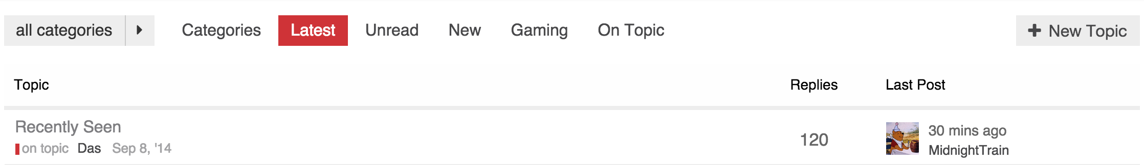
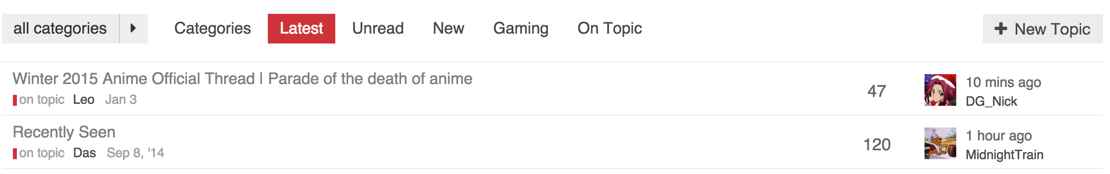
This is what I am running now. I have moved the thread list down to accommodate the update alert.
No alert
Alert
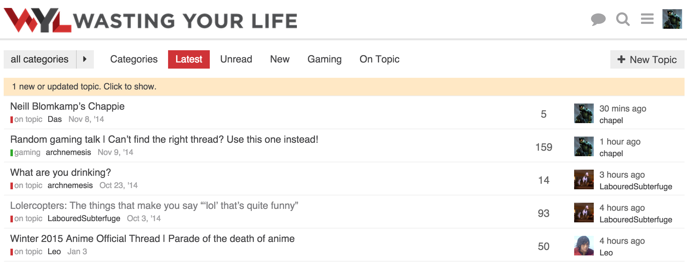
This allows the update alert to pop in without shifting anything down.
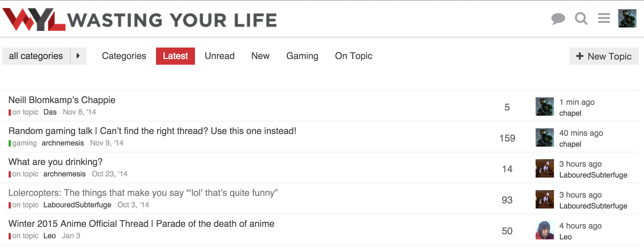
Functionality wise, I am fine without the table header, but visually it feels like something is missing. That could be just myself being used to tables on forums and how they normally look.
5 Mi Piace
It would be great that at some point, as admin, you can choose one of those different topic list designs out of some menu.
Or maybe even better, let the users choose, in some setting, how they want the topic list to look.
Btw what CSS do you use for your latest design @chapel ?