Odd, this is not specific to my design, happens on standard view as well, something about the data is bust I wonder if its somehow related to @eviltrout’s wiki changes
Yeah, I figured as much, but since we saw something similar that is why I thought it might be related.
The “topic featured users” has been buggy for as long as I can remember.
Made some changes, still feeling them out.
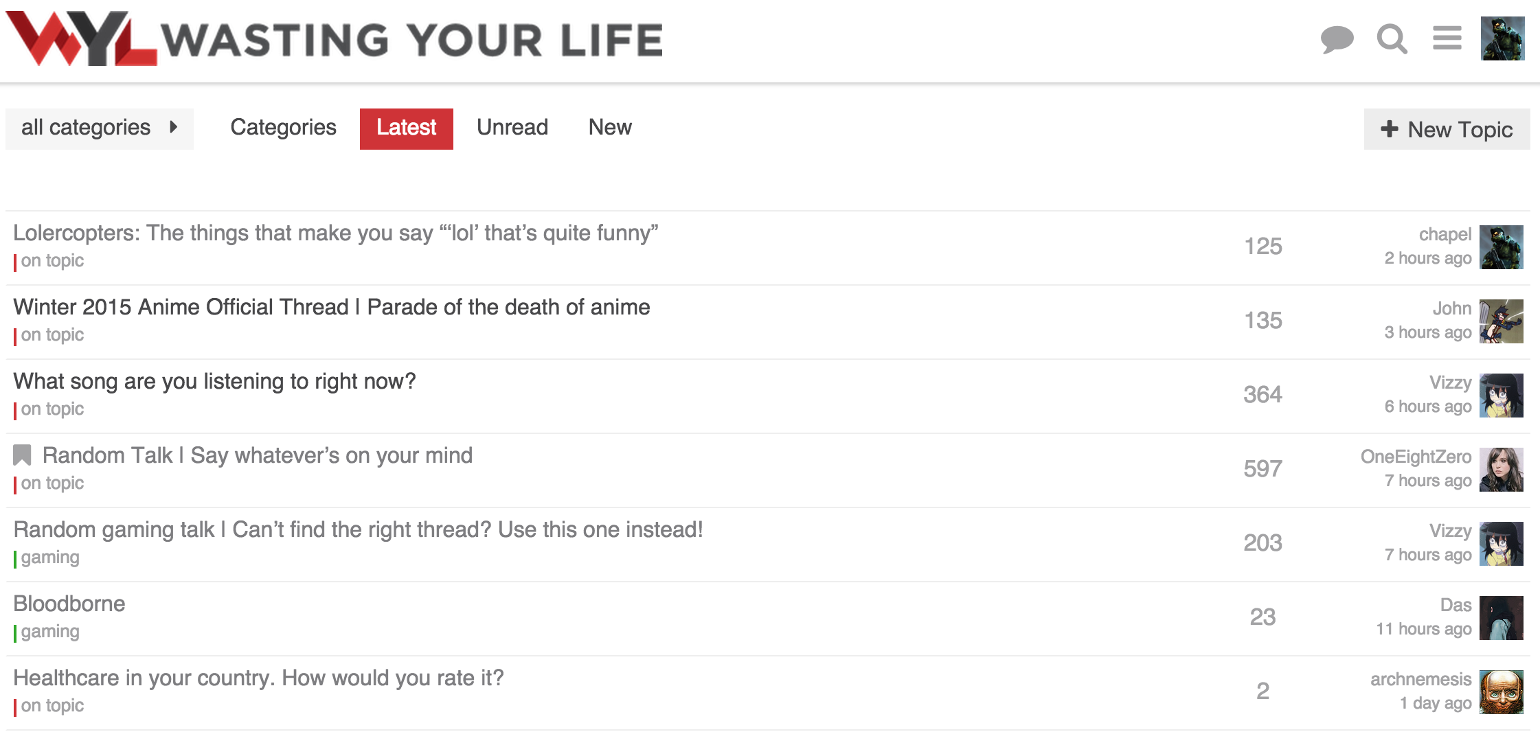
Notes on changes:
- Removed creator name and date
- Moved poster avatar to the right
- Right align text
- Move last post date under last poster name
I am thinking about what to do with the category. I like the idea of having a bar on the left of the full row with the category color. Though without the category name it would be a bit odd. The goal would be to have the topic title be on one line with nothing under it.
I was thinking about the time I cared about the creator of a topic. Generally it is only when it is first created, and the last poster section will have that info at that point. It lets the topic stand out by its title and activity.
4 Mi Piace
I think you should give this a try:
- full bar of color on left
- move category to its own column again
- keep the small bar of color next to the category name
(yes, it’ll be duplicated, but I think it could be worth it… in the category column, it builds the association of color and name… on the left, it provides it ‘at a glance’ when scanning topic names)…
Not crazy about those changes, to be honest…
Like this change… agree with your reasoning…
Curious what you don’t like about them? Did you mean the avatar location change as well?
I feel like the layout in sam’s current minimal design with the avatar to the left of the left-aligned text just reads better… I think I’m just used to seeing images to the left or the top of its metadata in general… It feels more naturally anchored to me that way.
While to a certain degree I am with you there. Though having the avatar on the right flows better in regards to alignment. specially with longer usernames.
I definitely prefer the username on top, as the date is somewhat secondary.
@chapel Have you thought about having the topic creator avator on the left ? Like they have here:
1 Mi Piace
I did try it but didn’t like it. Was too busy and detracted from the topic title. Felt weird having an avatar on the far left and one on the far right.
2 Mi Piace
There may be something to giving the OP some “credit” for starting the topic by putting their avatar on the very left and then having on the very right the last participant One end may kind of balance the other.
Been playing with my design today:

I really hate our greenish color there, nothing else in the design as that color.
Also I prefer square category style throughout so I added that.


I find the lines a tad disjoint from the category word. Note colors look washed out cause I am suppressing them with opacity.
Updating the first post with the current style.
1 Mi Piace
Progress bar looks too close to white for me here, (it’s blending with white background) can you turn up the saturation a tad?
Also probably destroying the accessibility specs
What I committed for the main theme is VERY close to the scheme slack use and is a factor of tertiary/secondary color, not a weird combo with the success color. Probably best open a new topic on this if you wish.

This is really night and day:

Note: the color is a hint, the numbers communicate the same thing anyway.

Ill revert the main theme for now, till @awesomerobot looks at it, but really no idea where there green is coming from. its odd
I’m used to the green, but I’m not a big fan of it.
From

2 Mi Piace
going with this in my theme for now:

but leaving core alone for now. I can’t be doing these kind of changes so close to release, and @awesomerobot can look at this anyway.
1 Mi Piace
You got the check backwards… the blue is foreground on white.

“Destroying” seems appropriate.
Restraint is good ![]()
