This is just awesome! I especially like the category bullets instead of these bars. One little suggestion: Make the topics’ color a bit darker
A little off topic but you should use lazy load for your site.
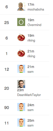
@sam Looks like your width setting for the recent poster is too small.
uh… just looks like @DeanMarkTaylor’s name is too long to me…
That’s just mean 
Remember that some characters are wider than others - only 7 W’s causes an issue.

That’s a fantastic design. Do you have any plan to set this as a
possibile theme to choose?
Looks good. Having two main columns to look at seems easier to scan. The category column in the middle (default template) is awkward and doesn’t give immediate context to the title since you have to look over to see it.
Yeah, and I especially dislike this one:

Posts, Views and Activity is ok (I personally would neglect Views) but Users does not provide any useful information for me. It may be important who is involved in a discussion but a) I don’t care and b) I open the topics which I am interested in before I look at these avatars. So  again for this minimal theme concept.
I wonder what it would look like if you added the extra participants in a column on the extreme right in something like a 2x2 grid (no padding between them) since you have more room with the two rows of text per topic. Might not be enough vertical space.
I beg to differ!

Lots of info there.
-
Size, if < 5 avatars then it’s a limited discussion, if 2 it’s “get a room you two”, if 1 it’s a topic nobody replied to
-
Noobiness. Lots of letter avatars? Drive-by participants, probably.
-
Recognition. I know the kinds of topics I can expect from certain folks here and sometimes I am excited (or… not excited…) when I see who started the topic or posted last.
-
It’s also faster to recognize avatars than name words for me.
-
These are my peeps. My people. I need to see them. It’s like Cheers, you want to go to the place where everyone knows your … avatar
And then of course

Thanks for your explanation. But these are just my 2 cents on this topic. I do like the minimal concept so everybody is happy. 

For this purpose we can use sticky posts. Users who actually google your forum (=sites with a lot of information or solutions for common problems) have no idea about who is “official”. Good examples for forums which I visit frequently without even having an account are:
So, if I am trust user level 4 and I trink coffe every day with the staff it’s fine. If I just google the forum the avatars are not quite helpful. After I switched from a bulletin board to discourse a lot of my users claimed that it is really confusing. After I went into more detail I found out that it is just too much (maybe redundant) information on the topic list for them.

As above. Most people won’t know your avatars (and avatars may change over time) so they will just ignore it.

May contain useful information  .
.

I just recognize sam and your avatar. But support and hosting topics also have a support category :).
So in my opinion these avatars are just a little bit clown vomit.
That’s odd because there’s this super famous book in the US, it’s called How to Win Friends and Influence People. One of the main points in the book is this:
Remember that a person’s name is, to that person, the sweetest and most important sound in any language.
You can replace this with
Remember that a person’s avatar is, to that person, the sweetest and most important image on the Internet.
So seeing your avatar in the lists after you post, even if you have no idea who anyone else is, is still valuable. The sweetest image…
I think there are two reasonable counterpoints:
-
I can see the argument that on a huge, massive, epically large, really busy Discourse instance with hundreds of thousands of users there’s no way for people to really keep track of each other, like New York City. In that case every topic will have the full complement of 5 avatars, so you can’t use it as an activity indicator as much and (well, I guess depending if you hang out in very narrow categories and subcategories) you are not as likely to know the people there.
-
Certainly new users won’t know anyone. So other than “how busy is this place” and “how many topics have real conversation with 5+ people in them” – which I’d argue is quite important information – the value of the avatars is diminished versus someone who stops in regularly. Note that new users get the
/toppage by default which does suppress avatars and shows users the “greatest hits” so it kinda solves this problem on the first visit anyway.
The 5 avatar design default may indeed be weak for large sites and for very new users, but it optimizes for small and medium discourses with moderate to low levels of activity. I think that’s correct. I think that represents what the vast, overwhelming majority of Discourse installations will be for the forseeable future.
The 1-5 avatars next to each topic do provide a lot of information at a glance – about people. That’s appropriate, because discussion is made of people. At least, the last time I tried to have a discussion with the same person over and over it didn’t go so well…
We have this super small, 30-member Discoursce install, and I wouldn’t imagine using it without the 5-avatar row. Super useful, exactly for the reasons you stated.
Now, I realize that we are discussing defaults (same thing in the clown vomit thread) and I trust that you know better. As long as it’s customizable, either via CSS, a checkbox or by modifying a template, I’m OK with whatever decision you come up with.
Sounds like another use-case for a setup wizard!
As someone who runs a forum exactly like this, I disagree with this assumption.
I used the default for months. At first I got complaints about the topic view, which I expected due to it being a change. No one said they liked it, everyone seemed to tolerate it.
When I switched to the minimal layout, I heard no complaints, but plenty of compliments and thanks. This is anecdotal of course.
I understand your reasoning, and to a certain level it makes sense, but without prompting and some teaching, users seem to look at it as extra noise. It really seems like a power user feature that not everyone enjoys. Even for myself, it became extra noise because I didn’t need to see that many people in a thread. If I knew who created the thread that gave me context if I cared about the thread. Seeing the amount of replies and potentially the last person gave me the rest of the context.
Thinking about it, the flaw with the user column is because it is hard to see what it means without explanation. It is technically information dense, with no real explanation. So while the information is valuable, it isn’t something that is easy to grep at a glance. Just because you @codinghorror think it makes sense, you really need to look at it as an outsider or someone new to really understand why it is confusing.
For me the 5 avatar thing is extreme noise on meta cause it basically does not matter to me when I am browsing meta.
I read all posts in all topics, so on the list all I care about is the last poster and creator as an extra, albeit weaker, clue (which is one reason I opted to have creator in text and not as a picture).
I think there is some credibility to the complaint that the 5 poster thing can be viewed as information porn by some users and information overload to newbies. I also get the power it provides.
Some communities are also destined to have super long usernames, just check out some of the usernames for moderators over at imgur:

And I can assure you that the imgur users enjoy their super long usernames, including these users from a couple of the most popular post comments today:
AdvancedIntellectualApplicationsofQuantumTunnelsUnfortunateSchmeltingAccidentImUploadingMyPicturesToThisWebsiteCalledImgurtomhiddlestonsthirdtesticlewhyyesyoucantouchmeallyouwantBatmansFirstEnemyWasCalledManBatHaveYouTriedInstallingAdobeReaderthisusernamehadbetternothavebeenchosenalreadyLayThineEyesUponThyFeildOfFucksAndSeeThatItIsBarren
I’m pretty sure they are also able to change their usernames any time they want.
I’m not saying it’s sane or right - but it exists.
Consider putting the username on the left.
@sam Found an odd issue:
On the topic list it shows the last post user like this:
![]()
But the actual last post was by codinghorror:

Thread in question: https://meta.discourse.org/t/idea-design-window-emoticons/24654/4
I haven’t seen it before.


