I’ve made some more changes.
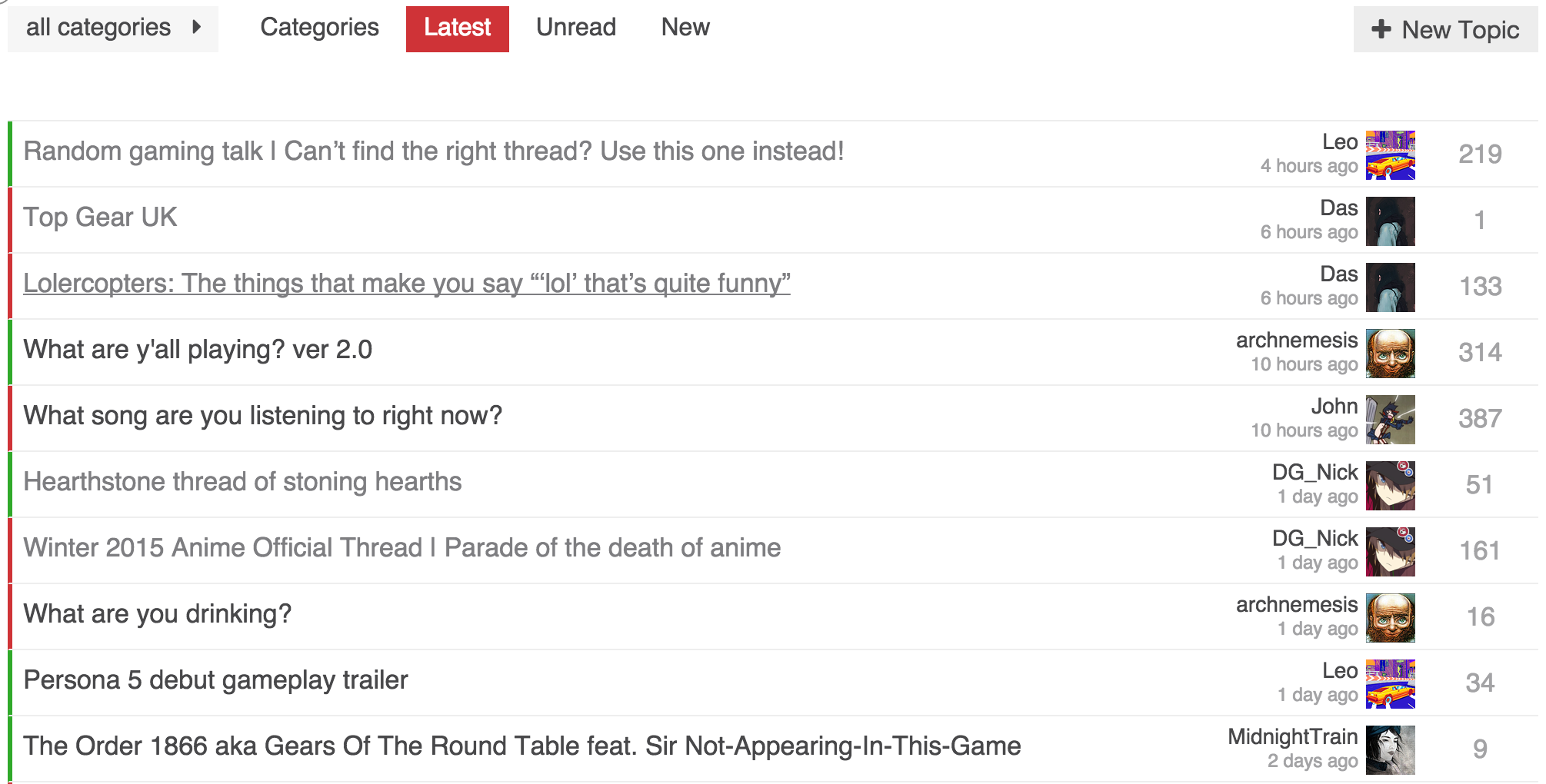
Left of topic title has category color bar. Our forum has only two main categories (on topic and gaming) so the colors are very helpful, but the name is not as important. I could see adding the category as a column if you had enough to warrant it.
I moved the replies to the far right. One thing I wanted is consistent positioning. Having replies be on the left of the last poster info, meant replies would shift around depending on the length of a users name. It also meant inconsistent whitespace.
I completely removed any of the info that was under the topic title. I prefer the cleaner look, but having everything on a single line except for the last poster looks a bit odd to me. Somewhat of an impasse because I can’t think of something better.
As always, still experimenting. Any feedback is welcome.